Leaderboard
Popular Content
Showing content with the highest reputation on 08/02/2023 in all areas
-
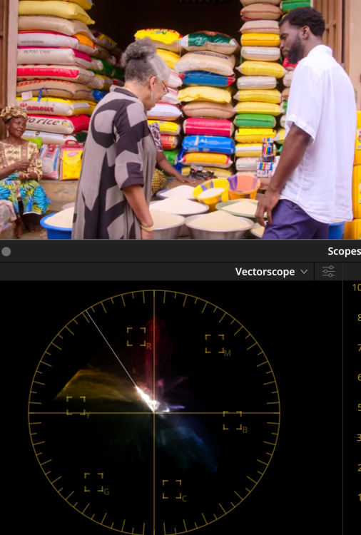
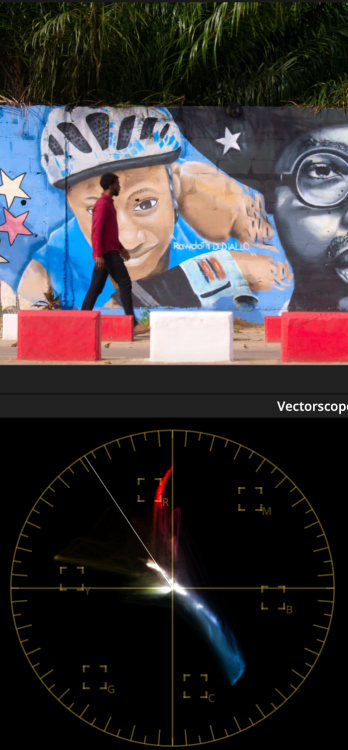
I've learned a lot about film-making over the years, most of it came through discovery and experimentation, but the best film-making advice I ever got was this... See how much contrast and saturation you can add to your images This probably sounds ridiculous to you, and I can understand why it would, but hear me out. Not only is it deceptively simple, but it's hugely powerful, and will push you to develop lots of really important skills. The advice came from a professional colourist on some colour grading forums after I'd asked about colour grading, and as I make happy holiday travel videos it seemed to be a logical but completely obvious piece of advice, but it stuck with me over the years. The reason I say "over the years" is that the statement is deceptively simple and took me on a journey over many many years. When I first tried it I failed miserably. It's harder than it looks... a lot harder. The first thing it taught me was that I didn't know WTF I was doing with colour grading, and especially, colour management. Here's a fun experiment - take a clip you've shot that looks awful and make it B&W. It will get better. Depending on how badly it was shot, potentially a lot better. It took me years to work out colour management and how to deal with the cameras I have that aren't supported by any colour management profiles and where I had to do things myself. I'm still on a learning curve with this, but I finally feel like I'm able to add as much contrast and saturation as I like without the images making me want to kill myself. I recently learned how the colour profiles work within colour management pipelines and was surprised at how rudimentary they are - I'm now working on building my own. The second thing it taught me was that all cameras are shit when you don't absolutely nail their sweet-spot, and sometimes that sweet-spot isn't large enough to go outside under virtually any conditions, and that sometimes that sweet spot doesn't actually exist in the real-world. Here's another fun and scarily familiar experiment - take a shot from any camera and make it B&W. It makes it way better doesn't it? Actually, sometimes it's astonishing. Here's a shot from one of the worst cameras I have ever used: We're really only now just starting to get sub-$1000 cameras where you don't have to be super-gentle in pushing the image around without risking it turning to poop. (Well, with a few notable exceptions anyway... *cough* OG BMPCC *cough*). Did you know that cinematographers do latitude tests of cinema cameras when they're released so they know how to expose it to get the best results? These are cameras with the most amount of latitude available, frequently giving half-a-dozen stops of highlights and shadows, and they do tests to work out if they should bump up or push down the exposure by half a stop or more, because it matters. Increasing the contrast and saturation shows all the problems with the compression artefacts, bit-depth, ISO noise, NR and sharpening, etc etc. Really cranking these up is ruthless on all but the best cameras that money can buy. Sure, these things are obvious and not newsworthy, but now the fun begins.... The third thing it taught me was to actually see images - not just looking at them but really seeing them. I could look at an image from a movie or TV show and see that it looked good (or great), and I could definitely see that my images were a long way from either of those things, but I couldn't see why. The act of adding contrast and saturation, to the point of breaking my images, forced me to pay attention to what was wrong and why it looked wrong. Then I'd look at professional images and look at what they had. Every so often you realise your images have THAT awful thing and the pro ones don't, and even less often you realise what they have instead. I still feel like I'm at the beginning of my journey, but one thing I've noticed is that I'm seeing more in the images I look at. I used to see only a few "orange and teal" looks (IIRC they were "blue-ish" "cyan-ish" and "green-ish" shadows) and now I see dozens or hundreds of variations. I'm starting to contemplate why a film might have different hues from shot-to-shot, and I know enough to know that they could have matched them if they wanted to, so there's a deeper reason. I'm noticing things in real-life too. I am regularly surprised now by noticing what hues are present in the part of a sunset where the sky fades from magenta-orange to yellow and through an assortment of aqua-greens before getting to the blue shades. The fourth thing it taught me was what high-end images actually look like. This is something that I have spoken about before on these forums. People make a video and talk about what is cinematic and my impression is completely and utter bewilderment - the images look NOTHING like the images that are actually shown in cinemas. I wonder how people can watch the same stuff I'm watching and yet be so utterly blind. The fifth thing it taught me was how to actually shoot. Considering that all cameras have a very narrow sweet spot, you can't just wave the damned thing around and expect to fix it in post, you need to know what the subject of the shot is. You need to know where to put them in the frame, where to put them in the dynamic range of the camera, how to move the camera, etc. If you decide that you're going to film a violinist in a low-bitrate 8-bit codec with a flat log profile, and then expose for the sky behind them even though they're standing in shadow, and expect to be able to adjust for the fact they're lit by a 2-storey building with a bright-yellow facade, well... you're going to have a bad time. Hypothetically, of course. Cough cough. The sixth thing it taught me is what knobs and buttons to push to get the results I want. Good luck getting a good looking image if you don't know specifically why some images look good and others don't. Even then, this still takes a long time to gradually build up a working knowledge of what the various techniques look like across a variety of situations. I'm at the beginning of this journey. On the colourist forums every year or so, someone will make a post that describes some combination of tools being used in some colour space that you've never heard of, and the seasoned pros with decades of experience all chime in with thank-you comments and various other reflections on how they would never have thought of doing that. I spent 3 days analysing a one-sentence post once. These are the sorts of things that professional colourists have worked out and are often part of their secret-sauce. Examples. I recently got organised, and I now have a project that contains a bunch of sample images of my own from various cameras, a bunch of sample images from various TV and movies that I've grabbed over the years, and all the template grades I have developed. I have a set of nodes for each camera to convert them nicely to Davinci Wide Gamma, then a set of default nodes that I use to grade each image, and then a set of nodes that are applied to the whole project and convert to rec709. Here's my first attempt at grading those images using the above grades I've developed. (This contains NO LUTs either) The creative brief for the grade was to push the contrast and saturation to give a "punchy" look, but without it looking over-the-top. They're not graded to match, but they are graded to be context-specific, for example the images from Japan are cooler because it was very cold and the images from India were colourful but the pollution gave the sun a yellow/brown-tint, etc. Would I push real projects this far? Probably not, but the point is that I can push things this far (which is pretty far) without the images breaking or starting to look worse-for-wear. This means that I can choose how heavy a look to apply - rather than being limited through lack of ability to get the look I want. For reference, here are a couple of samples of the sample images I've collected for comparison. Hollywood / Blockbuster style images: More natural but still high-end images: Perhaps the thing that strikes me most is (surprise surprise) the amount of contrast and saturation - it's nothing like the beige haze that passes for "cinematic" on YT these days. So, is that the limits of pushing things? No! Travel images and perhaps some of the most colourful - appropriate considering the emotions and excitement of adventures in exotic and far-off lands: I can just imagine the creative brief for the images on the second half of the bottom row... "Africa is a colourful place - make the images as colourful as the location!". In closing, I will leave you with this. I searched YT for "cinematic film" and took a few screen grabs. Some of these are from the most lush and colourful places on earth, but..... Behold the beige dullness. I can just imagine the creative brief for this one too: "make me wonder if you even converted it from log...."2 points
-

The best film-making advice I ever got
John Matthews and one other reacted to fuzzynormal for a topic
Another great bit of advice I got in my early days was to go study paintings. Particularly Vermeer's and Caravaggio's. As an idiot that didn't understand what made a nice image work and a bad one fail, just analyzing and deconstructing the craft of painting helped a ton. Absolutely brand-dead simple ideas like having your subject brighter than the background (contrast) confounded me as a newbie, but once I started seeing the techniques like that in practice I couldn't unsee it, and I got better. Which is why I'm pretty camera agnostic these days. There's so many fundamental techniques that need to be in place and exercised to create awesome images. Grabbing the most expensive camera/lens doesn't accomplish that for you, it only assists.2 points -
The best film-making advice I ever got
solovetski reacted to PannySVHS for a topic
Great read and recap! Thank you! @kye I feel, like my LX15 is almost everything i need in the image quality department but that is for my personal work of course. Or maybe beyond? I got inspired by this great but slippery camera to shoot personal stuff again. The slippery tiny body forces me to shoot, frame, move and conceptionalize in the moment with care and dedication. The odds of ergonomics become a challenge and by practice actually great. Realizing its advantages, there are many of them, this camera has indeed become my favorite personal camera. It equals my love I had for my old time favorite, the legendary G6. Image quality is plenty. That 8bit codec in 4k is the same as in the GX85 and punches far above its weight. Grain, texture, color palette are beautiful. I shoot in vivid for gradeabilty in post. I got this advice from reading Harrison Kraft giving advice on his LX. Ooc colours are okay in this profile, in other profiles really gruesome what made me diguise this camera right after purchase. Thanks gosh I was wrong about it. Another thanks to kye for elaborating on pushing the color in the color profile or at least not berobbing the camera of it, due to the logic that the processing is before codec compression. So, filming in vivid and taming the peak of highlights down to around 768 in post and the image becomes already much better. Working knee and toe, saturation, coolness and warmth and I am already close to what i like. That is in the classy 8bit 4k, no 10bit in sight or needed, cheek in tongue.:) The HD 50p 25mbps codec on the other hand is pretty gruesome. On a side note, the tiny 10mbps codec for 25p 720p on the GX85 is surpisingly strong, which sounds admittedly silly. But that's what I had to find out on accident when I filmed an important family celebration in 720p glory. Of course I was silently screaming "Shyte, I fxxxked up big time this time!" when I wanted to drool over some of my cinema verité awesomness. 😊 But surprise, it held up pretty good regarding achievable hues and color work. Just another example how good even now super affordable or cheap 8bit 709 cameras have become. A Sony A6000 with the 50mbit codec update is an interesting prospect in that regard and would be the ultimate 1080p S35 8bit 420 somewhat pocketable hybrid cinema camera. Lotta categories of greatest cameras. So every fan finds their altars. 😊 Lens on the LX is beautiful. Such a magnificient rendering in all focus lengths. Btw, as many of you know, in 4k the LX15 has only 2/3 inch sensor estate. Still trumping a G6 in lowlight, despite the m43 sensor of the G6, which is four times the area size. I call the LX my personal 16mm cinema pocket cam. I don't mind the missing S16 and be happy with close enough to 16mm powerhouse.:) Here is a repost of Harrison Krafts video. Thanks to this guy I started doing personal work again.1 point -

A6700 - FX30 sensor 👀
Amro Othman reacted to MrSMW for a topic
It’s pretty obvious from that side to side that the first pic was taken in sunshine and with the second, a cloud had passed over so if this is the only evidence for any color difference, the clown show is in town. But I haven’t watched the videos and I’d expect some with them having different sensors and one being FF and the other APSC. Same or different lens?1 point -
A6700 - FX30 sensor 👀
Amro Othman reacted to SRV1981 for a topic
Not sure it’s about ethics - at all. It’s profit. Want all day video? Buy an fx30/fx3/fx6. Want a hybrid ? Buy an a7iv/a6700/a7C 5 years ago I’d be in shock to have these options and quality This in fact I’d be happy getting the a6700 for hybrid use and if demands dictate more - grab a used fx30 for long form video. Best AF in the game, best DR at price points, best log profile at price point, easy single lens mount with cheap 3rd party options. as a non-paid user of these products I’m very happy with this1 point -
A6700 - FX30 sensor 👀
Amro Othman reacted to barefoot_dp for a topic
Why do you assume it's intentional crippling? If it's such an easy barrier to overcome, why has no other company done it yet? Maybe it's actually just beyond the current engineering and technological limitations, or not financially viable - but they want to give us the option to use it in some form anyway. Intentional crippling would be if they took the FX30 sensor, put it in the a6700 body and then DIDN'T include 4K120p. Then the same people screaming bloody murder about overheating issues would jump on here and complain about Sony intentionally withholding capabilities that they know the sensor has. You just can't win with some people. As for making the limitations clear - who do you think writes the brief for all those Youtubers? That's how they make the limitations clear in 2023. It's not a camera that interests me at all - It's not at all a professional cinema camera, so it's not for me. If other people can't afford a better alternative, then they'll have to learn to compromise. But to write off a camera that is not intended for your desired uses, because it's not capable of doing something no other competing camera can, is a little silly.1 point -
A6700 - FX30 sensor 👀
Amro Othman reacted to barefoot_dp for a topic
Why get so worked up about it then? You clearly deflected the question as well; what other camera is there that offers 4K120 at that price? I can't think of any. Which means you're expecting Sony to solve a problem that nobody else has even attempted to (4K120p 10-bit in a very compact body at a very affordable price). The next cheapest (mirrorless) option I know of is the GH6, and to pull that off they had to have a smaller sensor, much larger body, and charge twice as much. Looking at the videos so far it looks like overheating issues are limited to 4K120. So, if you ignore that mode entirely, you've still got a camera that is on par with the competition at that price, but with better AF. You just also have the option to occasionally get some shots at 4K120p. And all this comes in a consumer photo camera. You can't be upset that a company won't blow their entire R'n'D budget trying to satisfy a few people who expect to be able to use it beyond what it is designed and advertised as (yet who won't buy it anyway).1 point -

why is this "too wide?"
Dave in Costa RIca reacted to rainbowmerlin for a topic
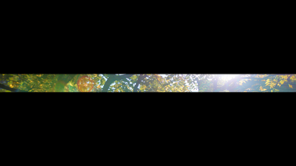
On this topic of wide crops, I've got an example here which is a still photo of mine (Fuji XT3) rather than a film. It was originally a fairly boring standard ratio photo of a field, which I was about to discard as not worth printing. But I noticed that if I just took a relatively small proportion of this as a wide crop lower to the ground, it was more visually interesting (and made a nice print in A4 width). No reason this perspective couldn't work as an occasional shot in a film also, with the radical shift in perspective jolting the viewer's attention. Though hopefully done in a way that the crop shows integrity as an image, that it's being done for an authentic visual reason, rather than as a gimmick. As here - the crop focusing the viewer's attention on the world of the rich abundance of small flowers just a foot or two above the ground.1 point -

why is this "too wide?"
Dave in Costa RIca reacted to Turboguard for a topic
1 point


