kye
-
Posts
7,881 -
Joined
-
Last visited
Content Type
Profiles
Forums
Articles
Everything posted by kye
-
If you have some time and don't mind fiddling around a bit, you could buy some second hand and then sell the ones you don't like. That way you get to test them. I found the primary difference between having one physically and simulating in post was that physical ones flare light-sources out of frame, and also flare more/less depending on how bright the light is, but of course you can't adjust them - it does what it does and you're stuck with it. In post it's the opposite. The other path is to simulate stuff in post and do a bunch of tests and see if that gives you what you need.
-
Without actually understanding how it works, I'd say most likely. All the more reason to think of it like a capture format rather than an intermediary format. I've heard that many/most/??? productions render their footage into Prores HQ and then never go back to the capture, rendering the final output from the prores files. I'd imagine that really high end productions wouldn't be like this, and amateur stuff where we can naval gaze optimise the final product for as long as we like won't be like this, but for folks seeking out a living the quality difference wouldn't matter enough to justify the expense.
-
Thinking about this further, it will likely first appear in streaming services, where (for browser viewing at least) they can implement it in the client and the server almost immediately and get the benefits straight away. I would imagine that bandwidth would be one of the largest costs of running a streaming service? From there it will take longer to work its way through the whole pipeline.
-
From the link: "After devoting several years to its research and standardization, Fraunhofer HHI (together with partners from industry including Apple, Ericsson, Intel, Huawei, Microsoft, Qualcomm, and Sony) is celebrating the release and official adoption of the new global video coding standard H.266/Versatile Video Coding (VVC). This new standard offers improved compression, which reduces data requirements by around 50% of the bit rate relative to the previous standard H.265/High Efficiency Video Coding (HEVC) without compromising visual quality. In other words, H.266/VVC offers faster video transmission for equal perceptual quality. Overall, H.266/VVC provides efficient transmission and storage of all video resolutions from SD to HD up to 4K and 8K, while supporting high dynamic range video and omnidirectional 360° video." Emphasis is mine. H265 provided about a 50% reduction in bitrate for the same visual quality over h264, so comparatively, h266 looks like it might be 25% the data rates for similar quality. These things take a while to roll out, that's for sure. Especially if implemented in hardware. Of course, maybe manufacturers will skip h265 in preference of h266 when the hardware is available?
-
That's almost exactly what I'm doing. I'm only doing holiday videos from the last 3 or 4 years, but there's a sizeable amount of them. I was doing a first pass on a family trip we did late 2018 and I'm mostly through it, but the selects are something like 2.5 hours long so I have a huge amount of cutting to do! I was really surprised when I saw that lol. Luckily I've already gone through the pain of organising the footage onto a single storage device. Enjoy the process - I really enjoyed reviewing the footage last night and remembering fun times etc 🙂 I agree about working from original material and not cutting scenes. One of the challenges I have with my selects is that I'll select any clips that I think can help tell the story and act as transitions or 'context' shots, which is difficult to tell ahead of time. My workflow typically follows this broad process: Do single pass making selects onto a timeline - choosing anything that might be useful. I never look at the raw footage again after this, so it's a hard culling pass. Sort out the sequence of things (often things aren't in order from different cameras) Go through and sort clips into a few categories: wow shots of people I know, ok shots of people I know, wow shots without people, potentially useful shots without people. Then I construct an assembly by including all the wow people shots and many of the wow people-less shots and pulling in the other people shots if I want more coverage of a person and pulling in the useful people-less shots if I need to establish a location or make a transition between locations etc Work out how long to make the final piece, then cut cut cut cut cut cut....... until it's in the ballpark Music and any audio Cut to the audio Grade, Export, Publish In that sense, being that many shots are chosen for context, of course you'd want to choose differently. For a showreel (from my understanding) there doesn't have to be any context, it's just shot - shot - shot - shot etc.. If you were making a different format, a compilation or longer piece, then some structure might be appropriate, in which case it would be differently structured again than a showreel.
-

Which microphone\recorder setup to use for hidden camera type of recording?
kye replied to Amazeballs's topic in Cameras
I'm just going to assume what you're doing is completely legal and ethical and all that stuff.... Maybe a smaller shotgun mic attached to the outside of her bag and pointed diagonally up? If she held her bag to the side then the mic would be lying across the front of her bag and she could kind of aim it toward the person. Handling noise would be an issue of course, but that would be easy enough to sort out if you gave her a live feed of the sound from the mic and she walked around a bit to practice. -
Canon 9th July "Reimagine" event for EOS R5 and R6 unveiling
kye replied to Andrew Reid's topic in Cameras
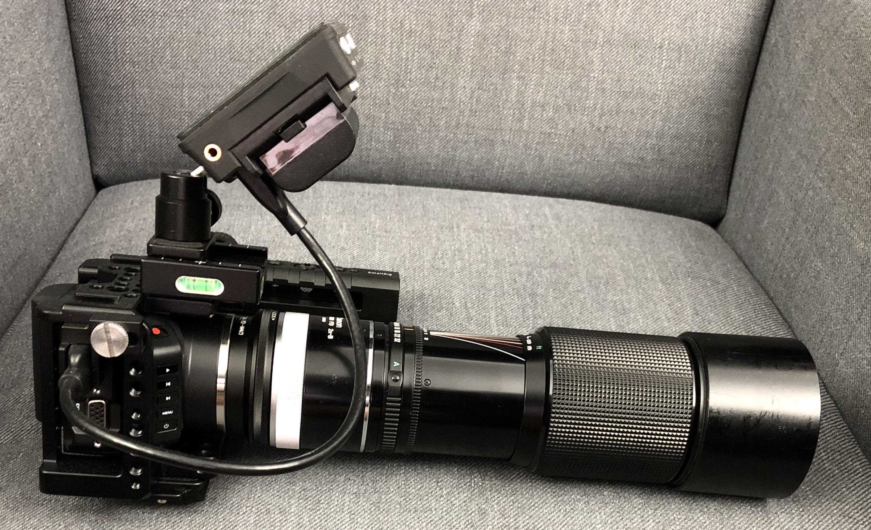
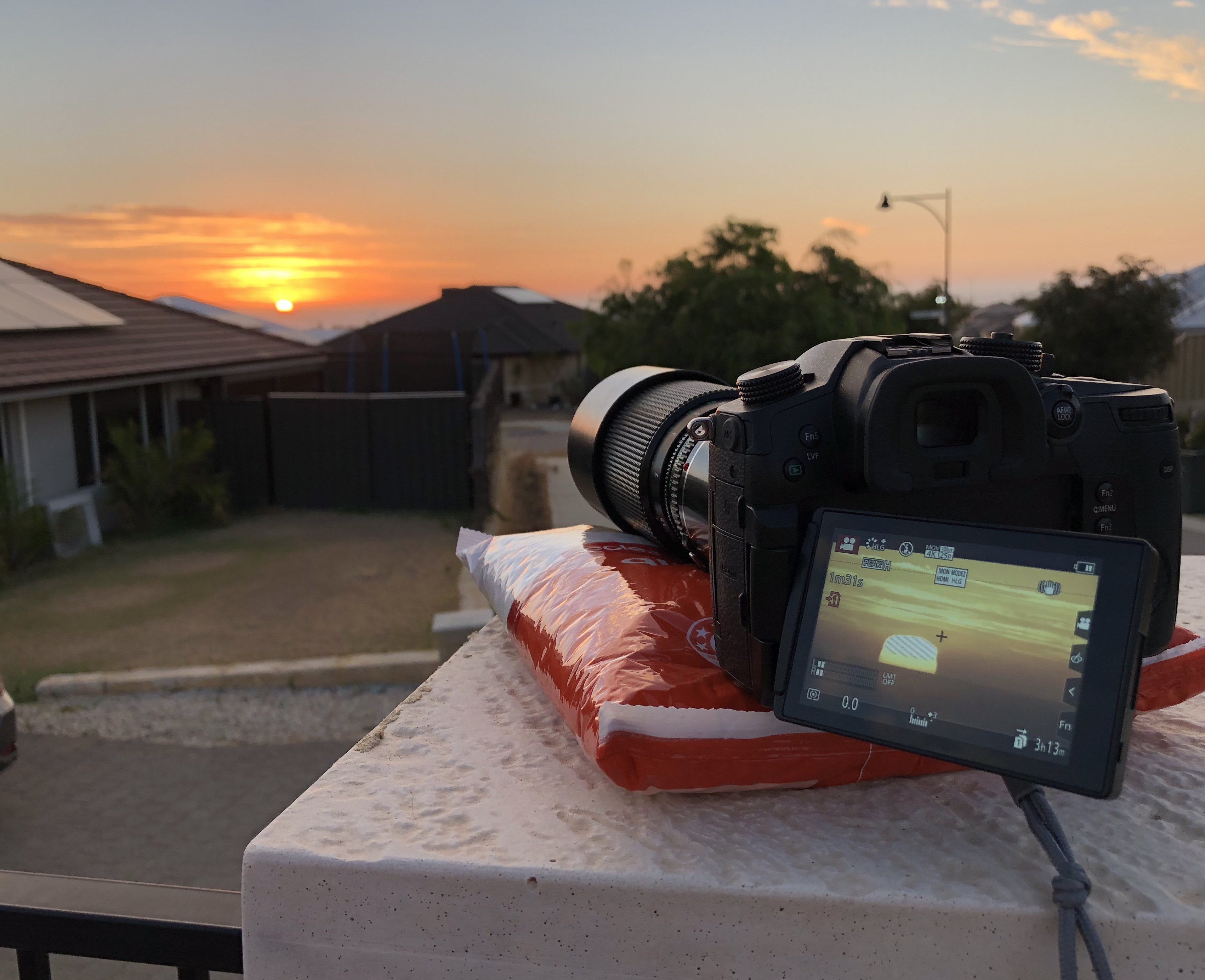
Do you mean 10K as in a sensor 10,000 pixels wide? I'm not surprised by 8K video but that's crazy! That would make it, what, 75MP?? Or go cheap and use FF lenses.. I use an FD 70-210/4 with 2xTC on MFT to shoot my kids sports games. Even the GH5 IBIS struggles with that - 840mm equivalent. Or here's the same optics on the Micro: I haven't used this setup yet, but when the sun starts to come around where I can see it hit the horizon again, I might return to my sunset project and record some RAW video. 1209mm equivalent!! At that focal length even the solid limestone wall I use as a tripod can't protect the image from people walking nearby. The GH5 in action.
-
I guess you'd have to know more about his project to see the links - certainly he can! I posted it as the Takumars are one of the famous vintage lenses that people like to collect, and the footage from the S1H should be top quality, so assuming that Mark did a good job filming (which I would assume he did) then the video should be a good example of footage from those lenses. I've got a few Takumars, and although they're not the SMC Takumars, they're still excellent and if I shot FF I think I would have just collected a whole set of them, they are beautifully made things and the images are very nice too. A great balance of being high resolution but not too sharp.
-
I agree. It's easy to get used to the manual nature of SD cards and converting footage and to stop seeing how antiquated the process really is. Anyone who thinks this is common sense can get a reality check by explaining the workflow to anyone under 20 - but be warned that the 'open and honest' feedback might be a shock! Even if it was via an app, being able to open an app and see thumbnails of what's on the camera and interact with them in useful ways would be good. Even if it was a case of the app being more of a configuration tool where you can link it to your social media accounts or to your file sharing devices and then be able to use the camera to do the stuff, which might be easier as it has more buttons so can use the screen as a display instead of having to show the UI as well. While I'm travelling my wife takes her own photos of the trip on her phone and shares them on facebook for the relatives to all see. If you take the sequence of operations to be: Take a bunch of photos or video Select some images Adjust those so they look nice (cropping, basic colour adjustments) Share on social The workflow on a camera / computer might take 20 times as long perhaps, and heaven help you if you're on Mac and want to draw on the image or put a comment there - now you're editing the image in photoshop because there's no equivalent of Paint on OSX! Even if your workflow is about quickly editing together a little highlights reel, the apps are so much faster without having to do all the media transfers etc..
-
I visited a site the other day that said it was targeted at professionals and amateurs, but the registration process required a link to your showreel or portfolio, which struck me as a bit strange considering I always associated those with being a pro. But it got me thinking - why not create a showreel? Yes, it would be terrible compared to the pros, but I'm not looking for work so in a way, who cares? It could also be a fun project that could be a real learning experience, especially if I post it asking for feedback. Has anyone who isn't looking for work or to attract others to a project ever made a showreel or portfolio? What were your experiences? The more I think about it, the more it seems like a good idea.
-
Just a follow-up to say thanks, and after a long time I've now pulled the trigger and bought the Beatstep Resolve controller software. It's now only 100euros, normal price, so that's cheaper again. After much more experimentation in grading I've realised that often the best approach is just using lift/gamma/gain controls straight-out on LOG footage, without converters or anything else, but adjusting these is a PITA if you're not using a control surface and therefore able to control two at once to kind of pull against each other. The learning journey continues!
-
Wow. Points for ambition and experimentation, but yeah, not so great. Is there a fundamental issue of lens size relating to sensor size? ie, larger sensors means larger lenses because the focal length has to get larger as the sensor gets larger in order to keep a consistent FOV. I also don't think it would fit in my pocket with the FD 70-210/4 on it, and the 14/2.5 pancake would be only be pocketable in very loose clothing. Maybe the Olympus lens cap lenses would be a good fit? Assuming you could actually get good images from it of course!
-
H254/h265 files are always difficult to deal with, but if you can adapt your work flow to rendering proxies then things get way easier to manage. I do understand that they don't work for jobs where you have to turn around an edit asap though.
-
I'm not sure about the Sony, but on the GH5 the focus peaking is only calculated on the screen/EVF resolution, not on the full-resolution image being filmed. I've found this a real limitation and one of the reasons that MF is easier with the EVF than the screen, as it has a higher resolution than the screen. I never thought about it before, but in that sense, extra resolution is useful for MF.
-
I agree that AI could doo a reasonable job of it if implemented well. I have wondered why there aren't more tools that fix issues in footage like this, but you're right that we've come a long way, and what's yet to come will dwarf everything still!
-
One challenge would be how to fill the frame. If you straighten the lines (from this //////// to this ||||||||) then the problem is that you have to crop off the sides a bit (see diagram #2) Then you'll either get black bars on the sides, or you'd have to crop in, but if it just cropped in and out based on horizontal movement then that would be very strange. If you were doing it in post with accelerometer data then you could make good decisions about cropping and other things, so maybe that's the better approach - to save the accelerometer data in the footage then process it afterwards.
-
To be clear, I'd suggest the vast vast majority are good natured team players. It seems that there are a select few who have talent so significant that they are tolerated in the industry, perhaps finding a small cohort that can stand to work with them. In many other industries it doesn't matter how good you are, there are levels of attitude problem that mean you can't really operate in any meaningful way at all.
-
I agree. Correlation isn't causation, but I do suspect that quite a few on here are also higher-level pros of some kind or other who care about their reputation. I'm not a film-making professional, but everything online is potential fodder for a background search when applying for work, so there is that. Of course, I've noticed that the film-making industry seems to be relatively tolerant of people who simply can't get along with others, whereas they'd have a much harder time in some other industries where things are more about getting along with people rather than your talent eclipsing your attitude problems. For example I can't imagine how Werner Herzog would go in the forums!
-
Interesting. The liftgammagain.com forums are real names only and are very civil. Other sites even require you to submit a profile and/or folio of work before you can join. It's an interesting idea, and anything that raises the level is worth a try. I'd support it.
-
The lensrental blog talks about how some modern lenses (including my MFT Voigtlanders) are built in such a way that they can't be serviced. I'd imagine its likely to be things like glueing instead of screwing things together etc. In a sense, almost everything is repairable, but the thing working against that is the cost of labour. When you buy a $1500 lens and it breaks, if its going to take 30 hours of labour to take it apart, diagnose the issue, order spare parts, re-assemble, test everything and measure the optics, and send it back to you, and they're charging $50 p/h then you just paid the cost of a new one in labour alone. You can argue that the one serviced by the technician might be better aligned and setup than one out of a factory, but in high quality manufacturing environments the equipment may be so specialised that its hard to replicate the things manually. For example machines might have special tools that can exert huge forces onto a part but do it accurately and do it without leaving marks because the tool shape is exactly the same shape as the surface they're pushing onto. There's a big push in places like the US for "Right to repair" legislation because you buy a huge $250k tractor and it develops a fault and in order to diagnose it you have to call out a licensed service technician because the computer port requires proprietary software and is encrypted to stop you fooling with it. So instead of you being able to diagnose and fix the tractor in the middle of the field in an afternoon you have to wait, pay a call-out fee, then have the tech spend 2 minutes working out that a sensor needs to be replaced and another 5 minutes fixing it.
-
In terms of hardware acceleration, the new T2 Chip in newer Apple computers has some kind of H.265 hardware acceleration, but I'm not that clear on if it's just decoding or encoding too. As it also does encryption it's hard to find references that don't talk about that and talk about the h265, but I've seen it crop up a few times in benchmark tests.
-
My lens owning goal is to use the lenses I have, and also to not use the lenses I have. We still have a trip booked with return flights to Europe in September and we're really hoping they cancel it because "Just don't use them, and forfeit the fare" is higher up on the preference list than "Fly to Europe". I say goal, because at this point in the global pandemic having a plan is ridiculous. In terms of using the lenses I have, I'd like to do some lens tests of the lineup I have, and also maybe do a bit of shooting locally might be nice.
-
Mark Holtze is pitching a Netflix show using his SMC Takumars and this video shows some footage from an advanced test he shot. Footage from the Takumars and S1H.
-
Haven't watched it yet, but noticed this in my feed:
-
@Super8 Is there anything you can show us where specifically the GH5 have plastic skin tones or where you can't get the same look? I keep asking because there are people who I have spoken to at length and whom I respect that believe that there is a difference, but I can never get enough information about what they're looking at in order to be able to see it myself. It's easy to point to a video shot in glorious light with a cast and crew that are on their game and say that a different setup can't do that, because the only evidence against that statement would be a video exactly the same but shot on a different camera, and at sunset and with the light and breeze just-so it's not possible to replicate. My questions is about what specifically can't be matched. I am literally interested in someone pointing at part of a still frame of a video and saying 'see this thing here.. FF doesn't do that' or 'see that there.. MFT doesn't do that', or 'see how this thing moves here... and now see on the other one how it's different... if you can't see it then watch for the way that X does Y' One resource that I found very interesting was this: https://www.yedlin.net/NerdyFilmTechStuff/MatchLensBlur.html The basic idea that you can match blur on different crop factors isn't the headline here, it's that Steve Yedlin is saying it (he'd know!) and is probably the most thorough analysis I've yet found. He doesn't talk about availability of lenses, but he definitely discredits the people that straight-out suggest that you can't get shallow DoF on a smaller sensor. He also doesn't talk about if there's a 'look' inherent in various sensor sizes, but he rules a whole bunch of variables out. I'll be the first person to admit that wider lenses with wider apertures that are sharp wide-open aren't available for MFT, and maybe that's the 'look' that you're referring to, but that would only apply to shots where there needs to be a larger aperture - MFT can easily match a FF 50mm at F4 for example, so in that particular shot it can't be the lack of lenses contributing to it. I'mm also be the first to admit I haven't got any glorious images to post that will "prove" the GH5 does hold up, but even if you gave me an Alexa I think I still couldn't do that - the weak link in both setups would be my skills in post! I'm also half-suspecting that it's actually not the camera at all, but everything else. What I mean is that film-making is a very deep and very difficult thing to do and get spectacular results, and by the time that you're good enough to do all the other stuff right you are spending so much money anyway that of course you just rent an Alexa for the shoot. So in a way I question if it's not that it's not possible to do on smaller sensor cameras, maybe just that it isn't done on smaller cameras. You're saying you can see the look, I want to also be able to see it.