kye
-
Posts
8,219 -
Joined
-
Last visited
Content Type
Profiles
Forums
Articles
Everything posted by kye
-
The tips for networking I've learned for networking in the corporate world (which is likely to be broadly similar) are: Be brief - people like it when you respect their time Say something in the message that is unique to them - this shows them you haven't copy/pasted to a million people Tell them why they might contact you Tell them how to contact you Tell them how to check out your previous work A message as simple as "Hi - I loved your work on project X, I do sound on similar projects. I'd love to work with you - if you have something coming up get in touch! <link to bio>". What I learned about networking: People hire people they get along with, skills are necessary but are a secondary consideration When meeting people, establish rapport with the other person first, ask questions about their own work and projects, don't talk about yourself or pitch unless they ask If you can solve a problem for them or give them advice (that is welcome!) then you'll stand out and be seen as useful If they ask about your work, don't embellish or diminish it - successful people can often tell when people are bending the truth (even on gut-feel) and its an instant fail Focus on understanding their situation and challenges and try to help You probably know much of this, but in case you didn't, and also for the lurkers, thought I'd elaborate.
-
Electronics are so complicated now that it's almost impossible to build your own stuff without having thousands, or tens of thousands, or hundreds of thousands of dollars of equipment. My dad loves electronics and messes around with Raspberry Pi computers to make automated things (like a greenhouse where there is a fan and motorised window which he can control to keep a desired temperature range etc). He had sometimes had issues building the little temperature probes, which are little chips that you mount on little circuit boards. He printed out the circuit board pattern and etched the circuit boards himself, but when it came time to solder on all the components around it, he found that the surface mount resistors he'd ordered were too small for him to see! Not too small to pick up and work with (which they were) - they were literally too small to see on the piece of plain white copy paper he'd put them on. To give you an idea, they would easily fit into the grooves on your fingers that make your fingerprints! He had to order a new batch and hope that they were bigger (they were) but still very very difficult to solder by hand. You could just say "use human sized components then" and that works sometimes, but with digital communications lines between chips, the length of the trace between the two chips matters, because depending on the physical length of the trace they work like echo-chambers with the digital signal bouncing back and forth, and also as antennas both broadcasting the digital signal to the surrounding areas and also receiving other digital signals from surrounding areas, so even just by putting two chips the wrong distance apart they can fail to talk to each other. I wish it was easy, but it's really not. Plus, then you have to program everything. Have you seen the code for Magic Lantern? They're only modifying the firmware that Canon has written, you'd be writing it from scratch!
-
 People seem to be obsessed with nit-picking the colour science of cameras, but indicate they don't colour grade for one reason or another. To me, even a few simple adjustments can improve the image so much more than the differences in colour science between manufacturers. In fact, the image out of camera is like a plain sponge cake straight out of the oven - it's nice and the quality matters but it's far from the final result. Colour grading is also talked about as being super complicated, and it can be, but it doesn't have to be. Simple grades can still be really powerful. Here are some examples from online, to show how much of a nice image is camera colour science and how much is colour grading. ARRI LOG: With ARRIs LUT: Grade: The above grade was done using only white balance, the lift / gamma / gain controls, a vignette, log wheels, in that order. To look at skin tones, the holy grail of camera colour science - here's a before and after.... before: Then on top of the previous look, here's additional treatments to give it more of a film look. These additional adjustments were: Gain (to lower exposure), white balance, saturation (lowered), darken shadows, in that order. Which was inspired by this frame from Sicario: Here's the video showing the whole grade: https://youtu.be/8GkcqEA72QM Next example - SOOC: with 709 conversion: Grade: Video link: https://youtu.be/fRDjEB6ryyQ Next one - with 709 conversion: Grade: Video: https://youtu.be/OmBBYHMi_ek Next one - SOOC: With 709 conversion: Grade: Video: https://youtu.be/UNW_8jcGJqw There are literally more examples online to count, but I just focused on the more neutral looking colour grades, as the people doing dirty film grades probably don't care about skin tone minutia when they're going to pummel the image with Dehancer etc. So, what's the TLDR? Even half-a-dozen simple steps applied in addition to the manufacturers LUT can make a huge difference It's about making small changes to make the image look slightly nicer, and they add up The reason that fancy cameras look incredible is because the colourist takes the great work done on set and expands on it How do I get started? Look at the image and work out what tool might improve it (if you have no idea, just try the basic ones) Wiggle whatever tool back and forth, deliberately going too far one way and too far the other way, then find the best spot Compare the adjustment you just make to see if it makes the image better or worse, if it's better then keep it, otherwise undo (sometimes a really good adjustment will look completely natural and the 'before' will look like something is being applied to the image and is damaging it) Go to 1. Repeat until you can't find anything that makes the image look better. If you're using another image to inspire your look, then for step 1, just look at both images and work out what looks different about yours, and try and fix it. Is it brighter? Darker? More contrasty? A different colour? More or less saturated? Adding a vignette to lighten your subject or darken the other areas of the frame is a good trick. Looking to find anything in the frame that's distracting and de-emphasising it is really useful too - even just lowering the brightness or saturation can really stop it from fighting for attention. Even by the time you've adjusted these basic tools, you'll be well ahead.
-
Smartphones tend to have a mic input, sometimes through an adapter, and the odd one has a larger sensor than normal. If you're ok with older small-sensor cameras then maybe a newer smartphone with larger-than-average sensor might be good enough?
-
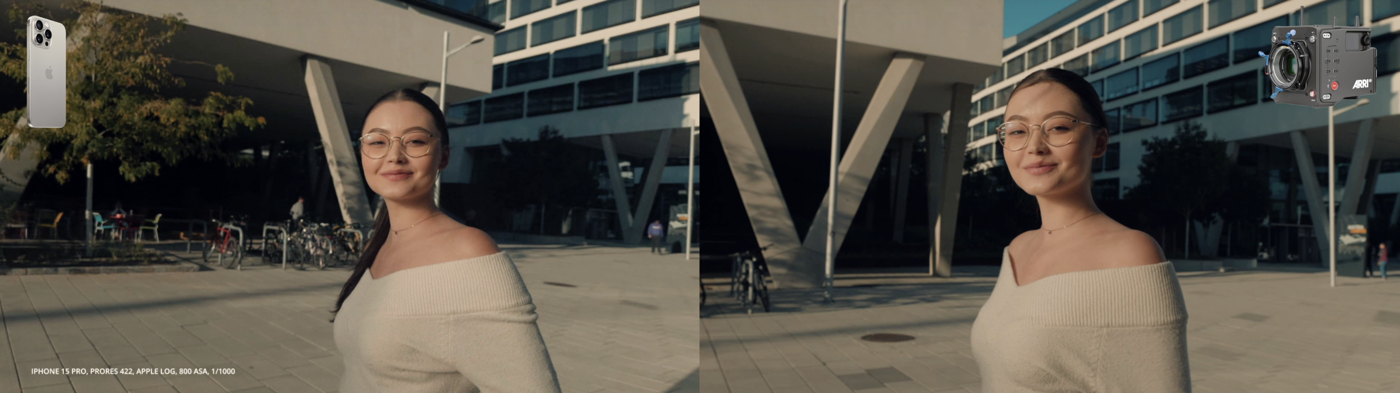
That video has flicked a switch in my head. I have now gone from asking "what can I shoot with my phone?" to "is there any reason to not buy this and shoot everything with it?" and "why do I need a separate camera at all?". I genuinely think that none of my cameras can better those results - not the GH5 or even BMPCC / BMMCC. I'm not even sure if cameras like the S5iiX would do much better.
-
Yeah, that's the best result yet.. it's genuinely incredible!
-
Controlled and properly shot/graded side-by-side Alexa 35 vs iPhone comparison.. It looks great but (spoiler alert!!) it's not as good as the $110K camera package, especially when pointing into the sun..
-
Looks like the project is progressing... we've talked about it a few times before: https://www.eoshd.com/comments/topic/44730-raspberry-pi-releases-an-interchangeable-lens-camera-module/#comment-354482 https://www.eoshd.com/comments/topic/61100-cinepi-2k-open-source-camera/#comment-471981 https://www.eoshd.com/comments/topic/73291-new-camera-with-global-shutter-for-rasberry-pi/#comment-563710 I don't recall the images being that interesting, but the 3D printed chassis reminds me of this thing, based on a deconstructed EOS M with Magic Lantern:
-
LOL about leeks.. I'd just go for potato and leek soup, which is quite lovely actually 🙂 In all seriousness, I think the biggest factor in any piece of equipment is how it makes you feel, because if you're feeling good then you'll make better compositions, people will react to you differently and you'll have an easier time and the people in the images will be happier and more at ease, etc. I get a good feeling when shooting with the GH5, knowing how nice the files are in post, and also with the GX85 because I like how it is to shoot with in terms of the size and form-factor. If you feel like you're fighting with the camera all the time, it won't matter what the colour science is like, the shooting and content will suffer more than the image can make up for.
-
What setup did you get for personal shooting? and what split on stills/video will it be?
-
Panasonic S series battery problems (including S5 II)
kye replied to Andrew - EOSHD's topic in Cameras
Just upscale it - people can't see the difference anyway! -
I find that there is deceptively little screen time from the BM cameras that is not either mounted to something (tripod, shoulder-rig, gimbal, etc) or slow-motion footage. The hand-held normal-speed footage I do see always feels drunk/drugged to the extent that I wouldn't use it in my work, and it's borderline in the work I see it in - you can feel that they cut away quickly from those shots in the edit, there is no lingering. Even the slow-motion shots are sometimes strained. Personally, I find the overtones of vertigo that this movement adds to the edits to easily overpower the wonderful image these cameras have. As such, I view the non-paid works of Florian and Matteo as mostly artistic camera tests. Matteo posts paid work on his channel, normally ads for wineries, and these are much more professional, and feature very little off-putting un-stabilised footage. All this, despite using stabilised lenses and these things weighing a significant amount even without a "proper" rig. I have no idea why this is the case, the Komodo material I have seen didn't strike me like this, although maybe I haven't watched enough of that to notice.
-
I suspect that basically everyone can do significantly better than that colour grade if they follow a couple of simple suggestions when they're colour grading. The first is to find a reference image, or set of images, that they like, and to refer to them throughout the colour grading process. It's easy to adapt to what you're seeing and to make tiny little changes until you've gone far astray. The second is to apply small changes that each make the image a small amount better. Obviously you will need to convert LOG footage to 709 and that step will be a big improvement, but apart from that just make small improvements. When you make each change, you should be able to compare the before/after of that change and each one should make the image better. If you applied the above and just played with each control, even not knowing what they did, you'd find the occasional one here and there that made the image nicer in your eyes, and by keeping each one that is an improvement you'd gradually be making the image nicer, and I genuinely think you'd do far better than that grade.
-
My main changes came from my two last big trips, which were Melbourne and Korea. Partly these changes came from shooting, partly from reviewing the footage, and partly from thinking about it since. I realised my iPhone 12 Mini shoots 10-bit HDR footage internally, and the colour science is quite benign / neutral Ironically, I did a test to rule out the iPhone as a real camera, but ended up proving the opposite! I preferred the shooting experience with the GX85 over the GH5 This is just purely down to the size and form-factor of the camera. Not only is it easier to carry and therefore faster to shoot with because it's close-to-hand, but less people look at you while shooting, the kids were less intimidated by it when shooting them, and it was a generally nicer experience. I preferred the speed of AF vs manual focus lenses The AF-S on MFT cameras is practically instant and very reliable. I don't need continuous AF as I tend to compose-focus-shoot-stop then repeat when I shoot a new composition. I realised that a zoom lens would get me a wider range of shots I am used to working a scene pretty heavily, seeing shots at various focal lengths, and also anticipating compositions and moving around to try and make them work (e.g. can I get a shot showing the view in the background, the church in the foreground, and framed by this flowering plant?). Having a zoom means just quickly grabbing all the shots I can see. I realised I don't need a fast lens This was an interesting one. I shot a lot with the 14mm F2.5 and it was borderline too shallow DoF wide open, because what I want is a bit of background separation, but not so thin a DoF that I get focusing issues, especially during the shot when the subject is moving around and the subject distance changes a bit. I realised that variable aperture zoom lenses (the cheap ones!) are surprisingly constant DoF lenses I just realised this today. For example, let's imagine I have the 14-42mm kit lens and I'm taking a mid-shot of a person. If I'm taking this mid on 14mm then I'd be 1.9m away, the lens would be at F3.5, and the DoF would be 2.9m. If I take the same composition at 42mm then I'd be 6m away, the lens would be at F5.6 and the DoF would be 3.6m - very similar! This is actually what I want creatively - a mid shot is an environmental portrait so having a DoF of 3-4m will include what's around them but give a bit of defocus outside that range. For the same lens, if I shoot a close-up, the DoFs range from 0.6m/24" to 0.8m/31" which is appropriate as a close-up is more about the person in isolation so a bit more separation is a nice thing to have. I realised that my 12-35mm F2.8 lens on the GX85/GH5 has adequate low-light capability as a walk-around lens This gives me enough low-light performance as a walk-around lens, and if I need better low-light then I will most likely have enough time to pull out a faster prime. My 7.5/2, 17.5/0.95, and 50/1.2 are small and light enough to take if I know I'll be going somewhere with serious low-light. For example, zoos at night, less-lit places at night like the beach, lookouts at night, etc. I've also learned a TON about colour grading and how to get the most from what I have, with the most important thing being that one critical difference between over-sharpened digital, high quality digital, and film is how it renders the contrast on fine detail, and conveniently, a simple blur will fix sharpening and give digital the same rendering characteristics as film LOL. The name of the game is getting the images you want with the least work, so no criticism from me on how we all get there. I also decided when I started this that I'd do things the hard way and therefore learn the most, rather than just buy my way to good colour (which is realistically just buying a Canon or recent Sony camera and Dehancer/Filmconvert). I fear I may have over-emphasised the potential complexity of Resolve and colour grading, without putting adequate emphasis on the fact that the most mileage comes from the basics, and it's a game of diminishing returns that kicks in pretty quickly. I've contemplated starting a thread showing what benefits can be had from only using very simple tools. Not sure if that would be worthwhile.
-
Panasonic S series battery problems (including S5 II)
kye replied to Andrew - EOSHD's topic in Cameras
Physically... the 200Mbps is just about right for bitrates 🙂 -
I agree - the colour grading looks to be with one of the film emulation suites, and is very very heavy handed. However, I think that this video shows a number of things... The shots included a wide range of difficult situations and held up. There were high-DR scenes, including the sun. There were low-light scenes, including a fire which wasn't clipped to hell. There was slow-motion, etc. None of it looked like there were any issues at all - sure it wasn't an Alexa 65 amount of DR but the images didn't really suffer either. The footage didn't break-up under an extreme grade. This is quite an accomplishment and anyone who knows what it's like to grade images from very small sensor size cameras know that when you push the image, especially to include huge amounts of saturation like this one has, the image very quickly shows its digital thin-ness and brittleness, but this didn't not happen. There were lots of skin tones pushed severely and no-one looked pallid-yellow or lobster-red. It's very difficult to push that amount of saturation without lips becoming glowing-red or there being yellowish areas (or both), and then when you try and compress the hues by pushing both sides towards the middle hues, it's hard to keep the right colour contrast - so many tools make people look like their whole face is covered in foundation by making the whole face the same hue. This is a real-world test by a real-world person. In the same way that the SlashCam test is valuable because it has been shot competently and hasn't been messed with in post, this is a valuable test because the person who made it obviously isn't a professional cinematographer or colourist, it wasn't shot in controlled conditions with pristine lighting catering to the exact weaknesses of the sensor and including models who had perfect skin even before they spent an hour in make-up. Any camera can look glorious if you do that. This sort of test indicates what anyone who gets the phone, waves it around, then colour grades it with Dehancer/FilmConvert/Filmbox/etc can expect to get. It's not a beautiful film, but it's a useful test of the camera.
-
Panasonic S series battery problems (including S5 II)
kye replied to Andrew - EOSHD's topic in Cameras
But not it's size!! -
Not unless you're shooting long record times and we all know what that means..... booooooooooring films!!
-
I've seen quite a few videos from the BMCC6K now, and they all seem to shoot and edit in 3:2, which I find quite strange.... CAN doesn't mean SHOULD! This one is an 8K YT upload:
-
Great stuff! The single biggest predictor in the quality of YT video is the planning (or lack thereof) beforehand. So many YouTubers ramble incoherently in every video, but are then concise in their Q&A videos, which tells me they normally hit record without thinking, or having a plan. Finding a tool that works for you is great. I've heard it's common for people editing documentaries to use index cards stuck to a wall to organise the story arc and which beats to hit in each section, etc.
-
Great video and looks like a good channel to follow in future - people doing controlled and straight-forward tests are rare unfortunately! This result is what I was hoping for and good to see. When I did the image quality tests comparing different codecs and then doing the mathematical comparison with the original file it showed how much more efficient the newer codecs were over Prores, which is a now getting quite old. There are situations where I would still prefer Prores over a h26x codec, but those are getting less common as resolution increases (and the pixel-level compression artefacts get smaller). I wonder, can it shoot lower resolution Prores internally.. for example, Prores 4444 1080p? Imagine if we could independently choose the options like in BM cameras: profile (SDR, LOG), codec (H265, Prores LT/422/HQ/4444/4444XQ), Resolution (2K, 3K, 4K), Framerate (23.976, 24, 25, 30, 48, 50, 60, 120, 180, 240), and destination (internal, SSD). That would be a dream! I'd set it to LOG / Prores 4444 / 3K / 48p / Internal and just leave it there. Yes, for ease-of-use it's definitely becoming a powerful option. I've used my smartphone as a second camera for a while, and on my recent trips my smartphone replaced my action camera as the second camera with super-wide angle.
-
TBH the image quality on the new log makes me a little sad for all the potential image quality sitting unused in previous models. After all, the codec made no difference to the look (Prores SDR was still awful) so in previous phones it wasn't the codec, it was the processing. Sure, the smaller and less capable sensors from previous models wouldn't have been as good, but they'd still have looked better than the SDR mode on the latest one. Upgrading isn't a priority for me yet, but I must admit I'm tempted to pull a couple of stills from the above and see what tools I can use to make the SDR one look closer to the LOG one, and then try applying those tools to my own iPhone 12 footage and see if it's useful. As you say, the image quality is now proven thanks to this latest test, so now we just need to figure out the right tools and settings etc.
-
Enjoy your new camera - these Fujis certainly have a very nice image! I've bought the Wasabi USB dual USB-charger and two batteries pack for each of my cameras (GH5, Canon, GX85 / BMPCC, Sony X3000, GoPro) and had good results with all of these. The batteries don't have as long a lifespan (in years) as the genuine batteries I have purchased, but they still work out to be better value for money. I know they're a third-party company and there's a certain risk to that, but I've found it's a convenient and cheap way to get spare batteries and be able to charge in-bulk.
-
If you learn to colour grade then your images will be nicer than either of these by a very wide margin. On camera forums it is standard practice to compare cameras using only the manufacturers LUT or some standard transform, which is a reasonable way to compare cameras, but when you go into the world of colourists and colour grading they will often break down colour grades step-by-step, and compared to the final graded image the standard 709 conversion looks like pallid anaemic garbage in comparison - even with Alexas and REDs. Seriously, buy the camera and lenses and accessories that are most compatible with your workflow and then learn to colour grade. Even if you only apply a film-emulation LUT and then adjust exposure, contrast, WB, saturation, and sharpening, you'll be creating images that absolutely smoke the standard conversions.
-
Panasonic S series battery problems (including S5 II)
kye replied to Andrew - EOSHD's topic in Cameras
The more I learn about colour grading and human vision, the more I understand why such a thing might exist. Human visual perception doesn't see in even remotely the same way that cameras and displays work. It is both infinitely more sophisticated than the current state of the art in tools we have now, and also very flawed and easily duped with optical illusions of almost infinite number. Cameras and monitors/projectors are also radically less capable than it (although HDR is partly closing that gap) and so almost all the images we view are enormously processed (the sun is 16,000,000 times brighter than white in rec709) and in colour grading we rely on various tricks to make things feel less artificial. Humans are wired to stay alive and the human visual system plays a large part in this, detecting movement in our periphery so we react to predators/prey, and even motion sickness (which compares our inner ear movement to what our eyes see) makes us feel ill when it thinks we have been poisoned and are hallucinating, etc etc. Our vision is for much more than just walking around - all these incredible distortions in video are all bound to have a feeling of some kind, some sort of aesthetic quanta that go with them. How could they be a completely pristine experience when we sit and watch a 2D pattern of dancing lights impersonate a 3D environment, where it jumps from place-to-place, it moves and the perspective changes when the whole time our body is continually aware we're sitting down and motionless, it takes us to places that are warm and cold and where the wind is blowing and our body tells us we're on a couch eating snacks, etc etc, there is infinitely more. We can do this because we evolved the ability to look at a scene through a window / gap / mouth of a cave, and understand that what we see out the window might be a different white-balance / brightness / etc than the environment we are currently in. If we hadn't evolved this ability then TV would just look like a glowing object in a room and would make no sense at all.