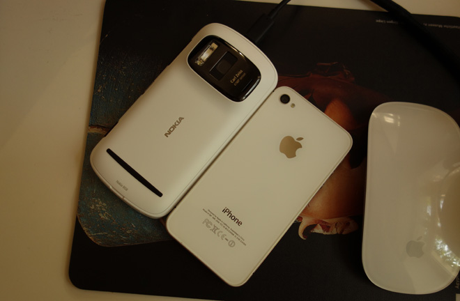
The best camera is the one you have with you and the best smartphone is an Apple iPhone.
Unfortunately the camera on your iPhone just became very very obsolete.
EOSHD deals with a dilemma.
Smartphones are the first camera in history to truly live up to that famous truism. No other camera has been recording life and your surroundings with the same intimacy as the omnipresent smartphone. Unexpected sights can make for great photos.
So when you come at some point in the future to look back over decades of lost moments and faded memories, it makes sense to have done them justice with the best quality available at the time.
Before the iPhone I was very interested in camera phones and Japan was leading the way with stuff like the Sharp 903. It had an optical zoom, auto-focus and 3MP sensor as far back as 2002. The initially very poor 2MP camera on the first generation iPhone in 2006 made me think twice about getting one but I did anyway because the rest of it was lightyears ahead of the competition. Nokia meanwhile have long had a line of top end camera phones but not the same fluency in smartphone OS design or the broad range of apps like Camera+, Filmic Pro and Instagram.
Apple’s approach to the camera hardware so far on its smartphones has been impressive. Responsive and minimalist, the sensor on the 4S is by Sony, an 8MP unit similar to the one on the Samsung Galaxy S3. The relatively low megapixel count makes for above average low light performance on such a small sensor.
Nokia have taken the opposite approach with the 808, packing in 41 megapixels to a CMOS manufactured by Toshiba but designed in-house by Nokia. This sensor is huge in compact camera and smart phone terms, almost as large as the 1 inch sensor on the Sony RX100 and Nikon mirrorless camera. The lens is a very wide 8mm F2.4 Zeiss. Although it has a fixed aperture it has a built in ND filter which slides in front of the lens, amazing considering the size. (Remember Sony said they couldn’t fit an ND in the FS100?)
Image quality
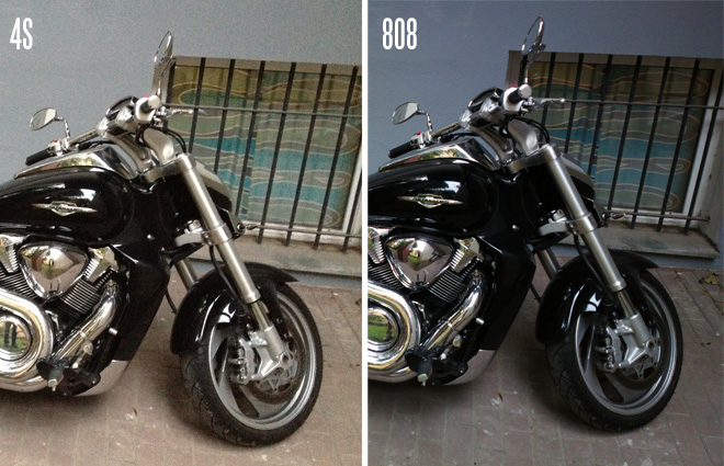
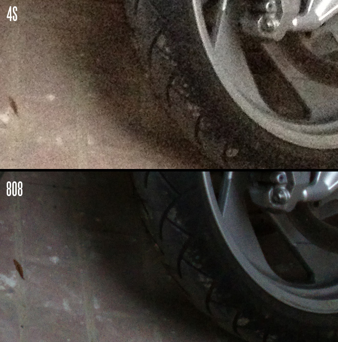
In terms of both resolution and dynamic range, the 808 PureView has the iPhone 4S for breakfast.
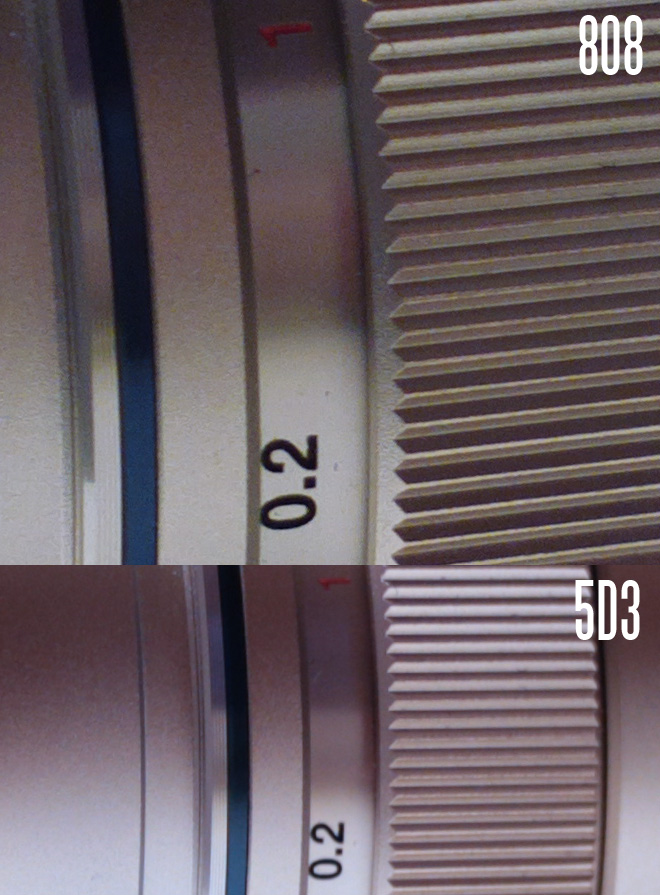
It is not just a new benchmark for smartphone photography but in the broader consumer camera market too. There isn’t a compact than can touch it for detail. It even out-resolves this Canon 5D Mark III still at 22MP vs 38MP. The only DSLR which out resolves it is the Nikon D800.
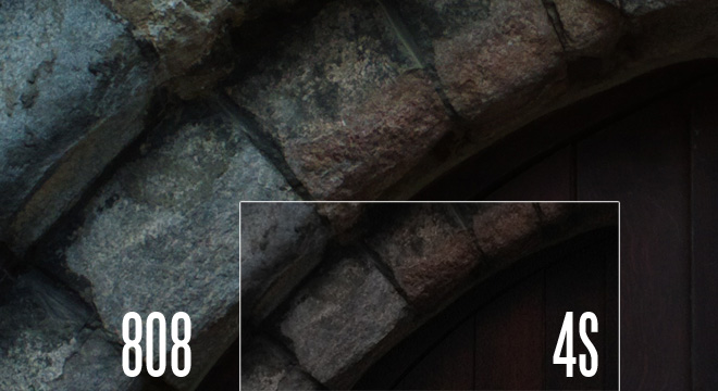
Both these shots were taken at the same focal length (28mm) and same distance (30cm)
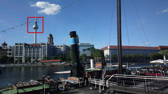
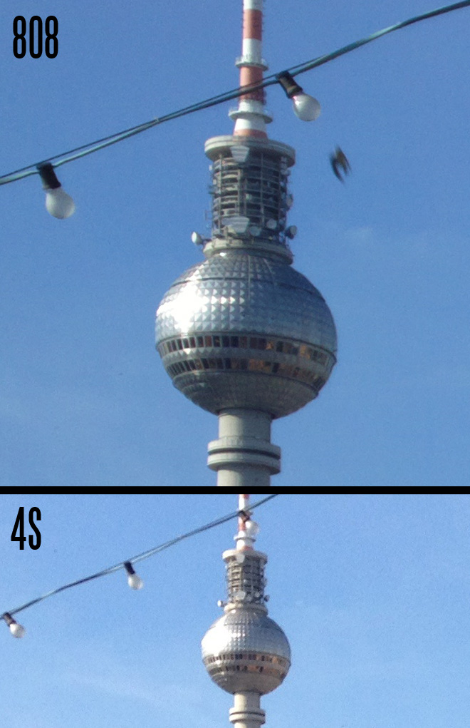
Below I’ve cropped out Berlin’s TV tower taken from several hundred meters away across the other side of the river Spree. Both of these photos are at the 1:1 pixel level on your screen.
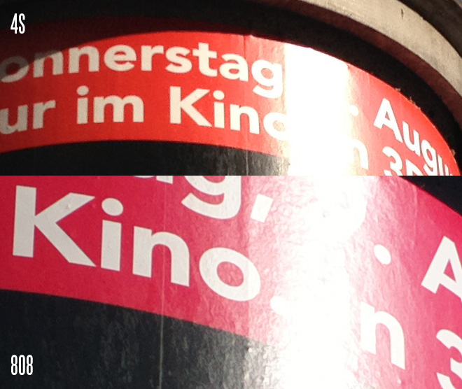
Below is a cropped area at 1:1 from the 808. I have laid on the same area cropped from the iPhone 4S at 100% view. The difference in resolution and detail is clear.
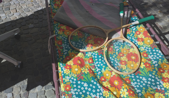
Some reviews have critisised the highlights and dynamic range on the 808 PureView. Although I’ve not formally tested dynamic range on a test so my test is subjective but I get a feel from the 808 PureView that the files have very good dynamic range indeed. There is quite a sudden point at which very bright specular highlights blow out to white (like all small cameras) so it is no full frame DSLR in that regard, but on subjects where you can underexpose the overall image to preserve the bright parts, the shadows are held onto admirably. Here is an example where one half of the sun lounger is in very bright mid-afternoon sun and the other in total shade. This is straight out of the camera with contrast dialled down for a flat image. I haven’t touched it in Photoshop.
Subjectively I feel the output from the 808 is closer to a DSLR than any small sensor compact in JPEG mode, let alone any other smartphone. It is flatter and not as punchy as the iPhone or as electronic looking. Although the pixels themselves are very small, the sensor is nearly 1″ so in Sony RX100 territory, which itself is really a DSLR in a compact’s body.
The live view display however doesn’t accurately represent the dynamic range you’re getting and it is only when you get the photos home and view them on a good calibrated screen that the real dynamic range becomes apparent. Live view is way too contrasty and when the image is taken the shadows are lifted and the highlight detail comes back. The iPhone’s live view display doesn’t do this. Also when you set the ISO manually and underexpose, the 808’s live view display doesn’t simulate exposure so it is not much good for any form of basic manual control. I’d also prefer to see the exposure compensation scroll dial dumped in favour of the touch point exposure control, which Filmic Pro uses on the iPhone.
This shot had silhouetted leaves and blown out sky in the bottom right in live view yet the photo itself shows great dynamic range.
Highlight roll off, although not as nice as a DSLR of course is better than most small chip pocket cameras and certainly an improvement over the iPhone 4S.
In low light the phone is hit and miss. Whilst it is better than the iPhone, it has a few issues.
First of all if you feed the jam packed full 41MP sensor with dim light, those pixels get angrier than Angry Birds and almost as noisy.
Even at ISO 250 if you are not shooting in good light, dimly lit low contrast areas will be speckled, blurry and blotchy especially if also under exposed. Anything above ISO 400 is very noisy unless you are shooting some kind of laser light show where everything is illuminated by megawatt lighting. This is not the phone to go chasing shadows with, but if your interior location is reasonably well lit or if the sun is out, noise just isn’t an issue.
The 808 is better than the iPhone 4S for noise around ISO 400-640 when you scale the 41MP frame to match the 8MP frame from the iPhone, it is silkier looking.
Despite it being perfectly fine by smartphone standards in low light, Nokia’s claims that more megapixels improve low light performance due to oversampling, rather than hinder it are really only half the story. As anyone who has used the GH2’s crop mode knows, yes noise is heavier at the pixel level than in the oversampled image (downscaled from the full sensor). But the best approach for low light sensor performance is still to have a low megapixel count and burst mode that layers images like the Sony RX100 does in Handheld Twilight mode. The Sony RX100 has 20MP on a similar sized sensor to the Nokia 808 PureView and is far less noisy at high ISOs thanks to that. If it were 10MP it’d be even better.
The phone has a tendency to chooses too slow a slow shutter speed when twilight does arrive. Even in the darkest and meanest of situations I can’t quite coax it out from under ISO 500. As a result I’ve had a number of blurry shots. You need a very steady hand if you are shooting in low light as the 808 will sooner choose 1/10 than ISO 800. Indeed this is for a good reason because ISO 800 and 1600 look terrible, even scaled from 41MP to 2MP on your laptop screen.
Video
Video is not really the main attraction for the 808 PureView. If video is a priority in your smartphone then the iPhone 4S with Filmic Pro is really quite stunning. It shoots at high bitrates with semi manual control and 24p with a level of detail which exceeds 1080p on a Canon DSLR. The Nokia 808 PureView is average for video. It doesn’t have any real issues with moire or aliasing but it is a little soft and compressed. The first few frames are buggy with heavy mud occurring until about 1 second in.
However the video mode on the 808 is unique in the smartphone world by offering a reasonably long lossless zoom, which also comes in handy for macro shots. The minimum focus distance reduces dramatically with the crop mode, even though the lens itself is nowhere near as close focussing as the iPhone 4S. Detail in this crop mode at the long end of the zoom is fractionally better than at wide angle. The zoom function whilst recording works really smoothly like an optical zoom on a camcorder and it rolls to a stop rather than jerking forward, but the frame rate does glitch occasionally when zooming.
The 808 gives a much wider field of view (roughly 26mm in full frame terms) compared to the iPhone 4S’s rather heavily cropped in view that is more like 35mm.
Although you can lock AF in video mode, the little manual control the 808 PureView has in stills mode disappears in video mode. You can’t force the ND filter on or off, or select a manual ISO speed, but you can select white balance manually.
The video mode is unusual for a smartphone in having a flat picture profile for grading in post. You activate this by dialling the contrast, sharpness and saturation down. It makes a big difference and really does help dynamic range and bring up detail in the blacks, but it doesn’t grade as well as a still because of the heavy compression and mosquito noise in the shadows.
The phone
The best way to treat of the smartphone component of the 808 PureView is to try and think of the device as a camera with some smart features. To use it as a phone carries some serious pitfalls, some of which will be addressed in future Windows based PureView models.
On one hand there is no other pocket camera in the world right now that offers as many smart features or apps, let alone the ability to call people, play your music collection or send texts. But as a replacement for your iOS or Android smartphone the Symbian OS gives you serious pause for thought because it is just not very good. I’m struggling to think of anything Symbian Belle does better than iOS in any department. It isn’t as awful as some people make out but it falls well short of the competition.
Details like the graphical design, scrolling and haptic physics are primitive and not very refined. The icons look like they are designed in MS Paint! When you touch to scroll a home screen on an iPhone, scrolling starts immediately if your finger is moving, however slowly. Logical, fool proof and satisfyingly tight design. Do the same on the 808 and for the first split second of moving your finger slowly across the screen the phone treats this as a held static finger press and activates an options box on an icon, before suddenly backing out again when it realises that doesn’t suit the gesture. It’s inelegant, untidy, confusing and annoying interface design. Start writing a text message and the keyboard hides the nearly always present toolbar at the bottom of the screen – breaking the most basic of UI design rules. You have to close the keyboard before you can go back to the list of messages or cancel the current message. It took me a few days to discover that the red button completely closes an app and the middle button allows it to run in the background for faster reactivation much like Apple’s approach to multitasking on the iPhone. There’s no visual cue that you are minimising or closing. The red button is just too often used as one of the main 3 buttons on the front of the phone, so I am still closing apps accidentally. When you do close an app this way (even a built in one like the camera or music player) the state of the app is completely reset. Close the web browser and your site tabs disappear. Close the music player and your track is closed and player reset. It is ridiculously easy to do.
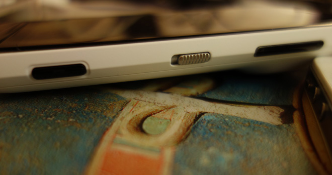
The physical buttons are not too well laid out. When taking a photo in portrait orientation holding the phone the right way up, the shutter button is at the bottom right. The phone compells you to be counter intuitive and hold it upside down for a better grip and just to get the shutter button under your thumb. In landscape orientation things are better but the lock button and shutter button feel cheap. The shutter button is too thin and too stiff on full press. The left side of the phone is empty and all the buttons are on the right. Apple’s placement of the lock button on the top of the phone, volume buttons on the left and sim-card tray on the right is far more logical.
The web browser doesn’t have the responsiveness of mobile Safari and cannot scale a site at the same time as keeping the text legible. The only way to read a scaled page is to zoom riiight in and then scroll constantly around. It repeatedly has issues with formatting pages, refusing to render fonts correctly or layout CSS as per the standards and it is slow. The maps app is just about bearable but again feels dated and primitively put together. The music player is better but don’t whatever you do copy your iTunes library to the MUSIC folder on your phone. By default it goes in an obscure sub folder of the Sounds directory with your ringtones! But by far the worst bit of the phone is the Nokia Store. Themes are universally ugly and mostly paid additions. Apps are created mostly in Java or Flash since the OS lacks Apple’s superb OSX based development languages and tools, which helps to explain why so many of the apps are of such low quality, as well as the payment system which recognised my Mastercard as a Diners Club, my German bank card not at all and refused to verify my UK Visa debit card. Eventually I had to pay for apps from my call credit. The default mail app meanwhile works via Microsoft Exchange ActiveSync and it took me 4 hours and 12 Google searches before I worked out how to get my GMail account working with it (here was my fix – the login name is your email but it must be AT googlemail.com not gmail.com – ridiculous!)
Symbian 3 on the 808 does not fall down for lack of features but because Apple does the details 10x better.
Conclusion
Overall the sensor and lens technology on the 808 is a genuinely groundbreaking achievement for a smartphone. Given enough light, a good subject and a close focus shot – the 808 is capable of pure gold. Although it has a narrower sweet spot than large sensor compacts like the Sony RX100 and far worse image quality in low light, it leaves other smartphones and compacts in the dust when performing at its best.
Video benefits from a lossless zoom and a flat picture profile as well as a nice choice of frame rates in the default camera app including 25/24p. However it suffers from an iffy compression engine and does not resolve as much detail as the iPhone 4S. Dynamic range suffers in video mode and colour is not as good either, so the iPhone wins that round.
Compact users who want a ‘smart-camera’ with apps, which can upload to social networks via 3G and WiFi should consider the PureView. It doesn’t compete with a premium compact in low light but in daylight there’s not a single consumer camera on the market which can touch it.
However as far as replacing your iPhone goes you will need to approach with extreme caution. If you only ever use your iPhone to text, call and play music with the occasional maps usage, and don’t mind the additional bulk of the PureView or the plastic build relative to Apple’s beautiful glass and alloy smartphone, then you might get away with it. But people who need a better smartphone like the iPhone 4S, Galaxy S3 or HTC One will have to compromise on the camera and stick to their existing device. Apple fans can still keep an iPhone as their main smartphone and swap the sim card at the start of the day when you feel photos are going to be a priority. The PureView still gives you the advantage of carrying just one device for photos, music and phone.
Pros
- Hands down the best smartphone camera for photographic image quality
- Huge gallery prints a real possibility thanks to medium format league resolution
- Wide lens and zoom in post make for more creative options after shot is taken (28mm in 4:3 and 26mm in 16:9)
- Video mode with lossless zoom
- Good range of frame rates in video mode including 25p,24p
- Very flat picture profile in video mode, like Technicolor CineStyle
- Good dynamic range for a smart phone
- Low light performance best yet in smartphone, but see issues in cons
- Attractive shallow depth of field on close up shots and portraits
- In daylight, better image than even dedicated premium small chip compacts
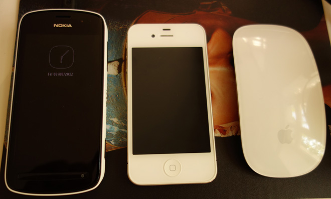
- Decent 4″ 640 x 360 AMOLED screen gives great colour and battery life, larger than iPhone 4S screen but lower resolution
- Considering resolution of images fast write times
- Micro SD card slot for extending storage, unlike iPhone
- Added phone feature (can send SMS and call people from a camera, wow)
Cons
- Bonus phone feature not up to standard of dedicated phone, maybe Nokia should enter phone market? 🙂
- First generation product syndrome (Symbian is being replaced with Windows 7 and 8 on future PureView models, wait or buy now?)
- Lacks overall build quality and design flair of an Apple device but costs just as much
- Auto white balance has tendency to choose temperature that is too cool, reducing impact of reds and oranges and giving minty greens rather than lush shades – not aesthetically pleasing like Canon colour
- Cannot match iPhone 4S video quality with Filmic Pro. Compression and resolution not up to same high standard
- First few frames of video clips corrupt (mud)
- Blurry shots at night too common, tendency to use slow shutter speed instead of high ISO and no stabilisation for stills
- Very noisy above ISO 400. But still better in low light than any rival smartphone at time of writing
- Harsh highlight roll off especially to very bright specular highlights
- Default camera app offers very little manual control especially in video mode
- Lens flare character often lacking charisma
- Slower shot to shot times than most compacts, but expected given size of images
- Lack of decent photo and video apps compared to iOS and Android. Nokia store very dated and rough around the edges
- Sometimes lacks responsiveness
- Screen resolution not on par with other leading smartphone OLED displays such as one on Galaxy S3
