Feel like I’ve had a breakthrough with the 5D Mark III on this shoot.
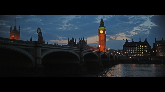
In London for David Hockney’s A Bigger Picture exhibition last week which is highly recommended (see my interview with Ted Chau), I found a few hours beforehand to grab a few shots on a walk down from Piccadilly Circus to the South Bank via Westminster. I had brought my 5D Mark III, GH2 and 4 lenses down. This was shot at twilight with the 5D Mark III in ALL-I 1080p mode. The Iscorama anamorphic was paired with a cheap Nikon E-series 50mm F1.8 pancake lens. (Anamorphic lenses like their other half to be rough and cheap!)
I did some shooting in Richmond with the GH2 and the same anamorphic / Nikon pancake which I’ll post later.
Anamorphic is 5D Mark III’s best friend
On the 5D Mark III an anamorphic lens helps make soft detail crisper because of the squeeze to create the wider aspect ratio. To go from 16:9 1920×1080 via the 1.5x anamorphic to 2.66:1 you downsample 1080 lines to 720 in post. As vertical resolution is packed into a narrower aspect ratio you end up with more detail per line.
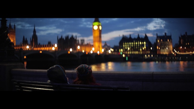
This conceals the main weakness of the 5D Mark III – that it doesn’t deliver much over 700 lines in the first place! Going from 1080 lines to 720 whilst maintaining the full 1920 width makes real detail look finer. Fewer ‘wasted’ pixels. It is better than cropping 1080 lines to 720 for a ‘fake anamorphic’ look. The lens is the important part.
With a 2x anamorphic the detail is compacted even more, and will look finer still. I’m looking forward to pairing the 5D Mark III with my Isco CentaVision 2x. I have even got to love the dramatic 3.55:1 scope! This aspect ratio works out at 1920×540 for 1080p displays.
Anamorphic footage can also be upscaled horizontally for displays with a higher than 1920 horizontal pixel count. You maintain the vertical resolution of 1080p and upscale it in the horizontal direction.
And let there be no confusion – I’m distinguishing between lines of resolution and detail. With the anamorphic squeeze you get fewer lines of resolution but the detail isn’t spread over as many pixels so it does’t look as soft. If it looks mushy spread over 1080 lines, it will look crisper compacted to 720 lines.
Another breakthrough apart from the beauty of anamorphic is the encoding profile.
The first time this footage was rendered out from my NLE I was thinking “What the hell is this”. I was really shocked at how bland and noisy it looked compared to the timeline in Premiere. All the subtle tones, the richness of the colour and smoothness was completely gone.
The 5D Mark III has H.264 at Level 5.1 which is relatively new. I’m using Adobe Premiere Pro CS5.5 to edit the native H.264 files from the camera. No need to transcode to ProRes 4:4:4 as Premiere’s timeline uses a 4:4:4 colour space on the fly so any grading and work you do in post has extra headroom, perfect colour sampling and no compromises. This helps. But what helps even more is that I exported to H.264 High Profile, level 5.1 from the original ALL-I 1080/25p which is level 5.1 originally. Premiere’s H.264 encoder defaults to only Main Profile, Level 4.2 for compatibility reasons with older software decoders. This seems to really conspire to screw the 5D Mark III’s footage.
Vimeo handles the higher quality H.264 format just fine and believe me the better source file makes all the difference. Technically speaking Level 4.2 has only 2.2 million luma samples and 8,704 macro blocks versus the 9 million luma samples and 36,864 macro blocks of level 5.1…. In practice this means far better colour, tonality, contrast, less noise and less macro blocking. (Level 5.1 is also 4K ready which gives you an idea of the data rate it can handle. More on the levels at Wikipedia here).
So nice to see the 5D Mark III’s encoder use Level 5.1 H.264 – but not very nice to have to figure it out without any guidance from Canon on how best to edit videos. Why can’t they just explain it in the manual?
Other tricks
Black-bars are part of the anamorphic feel (the top and bottom of cinema screens aren’t bright white!) so I prefer to use a 1920×1080 file for my anamorphic footage. This is mainly for Vimeo embeds where 2.66:1 looks odd if it is sat with a load of stuff around it on a white page.
I’m also encoding to a constant bit rate (CBR) at the moment rather than variable (VBR) as the empty areas of black causes some variable bitrate encoders and decoders to freak out and underestimate how much data to allocate the actual image. This file is 50Mbit CBR like the Canon C300’s broadcast ready MPEG codec. Overkill for Vimeo? I don’t think so, you really notice when the bitrate drops in a confused VBR codec.
All said, these export techniques maintain the strongest qualities of the 5D Mark III – velvety tones, rich colour and an almost complete lack of noise at high ISOs. Some of the shots are even pretty clean at ISO 3200 and 6400.
I’ve dumped VLC Player for playback of 5D Mark III files because it has some issues. The gamma switch is bad, and the footage just looks somehow more noisy like it isn’t being decoded properly. In Quicktime X it seems far closer to the richness of the original footage – though I am sure the gamma is a bit off!
Johnny Mark 3 – Alive?
I’m much happier with this camera now and tuning it doesn’t stop here.
Yes resolution out of the box is disappointing and the camera could have been so much better in many other ways too.
But there is a magic to full frame, as there was with the old Mark II. It is all in the rendering of the lenses.
I’m very tempted to try James Miller’s optical low pass filter removal but I’m waiting for a few more examples and a direct comparison with footage from a normal 5D Mark III which has been sharpened up in post.
Certainly the OLPF removal solution is very promising so far, though why Canon’s customers should have to get their screwdrivers out to improve the image quality on a $3500 camera is anyone’s guess. Maybe a question for Chuck Westfall.
Qualms
The only thing which was a pain on this shoot (minimal gear, on foot) was the 5D Mark III’s lack of articulated screen.
I’ve asked Steve Weiss at Zacuto to make a thin aluminium LCD panel that mounts via a articulated hinge to the base plate. I really miss the articulated screens of the FS100, 60D and GH2 when using this camera. The EVF is a lovely product but attaching it to the hotshoe or via a clunky arm to your rig is not a very elegant solution. The reason DSLR rigs have a reputation for being a bit ‘spidery’ is that they’re not integrated enough with the camera. Shooting on foot, with a tripod – why do I want a huge rig? I want to keep it light and just look down at the screen. I want a screen which I can flip up and down, angling it in seconds with one finger like on the NEX 7. Hunching over the 5D Mark III’s pokey little non-articulated screen is absolutely back-breaking at times and crouching all the time gets really tiring when you’re shooting at an upward angle on a tripod because the damned screen faces down. To be honest I’d rather Canon had sacrificed even the weather proofing for the 60D’s hinge, it makes that much difference to shooting on sticks!!
Remember the old Sony R1 large sensor bridge camera with that lovely Zeiss lens? This camera from 2005 looks ridiculously old now!! But it had a LCD monitor on the top like a mini FS100. I honestly prefer that to the way modern DSLRs are for video.
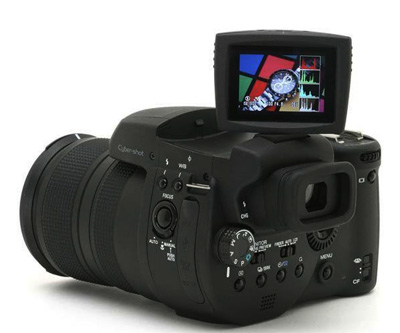
Above: the (very small and primitive looking by today’s standards) articulated top-LCD on the Sony R1.
Iscorama 36
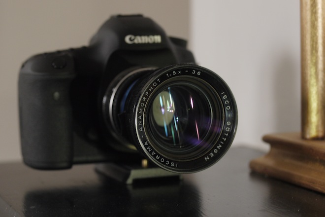
This lens cost me around 1500 euros in December and I’m very happy with it. Very small and light, focussing is a breeze. It is a 1.5x stretch. You’re getting a wide angle field of view horizontally with it and a standard 50mm frame vertically.
It does flare more than my CentaVision which is good, but not as much as I was expecting. It isn’t the multi-coated MC version. With the Nikon 50mm F1.8 pancake lens it is a good match. You get less vignetting with this compared to any other 50mm lens on full frame with the Iscorama, because of the simple optics and the small front element which you can get closer to the back of the Isco.
Being a pancake the E-series 50mm F1.8 also helps to reduce the extent to which the Iscorama attachment extends from the body of the camera. You don’t need rails to support it like some of the heavier anamorphic lenses (LOMO, CentaVision, Iscorama 54, etc.)
As I said in my anamorphic book, these lenses work best with ‘simple’ aspherical primes, like the Canon FDs and Nikon AI stuff. This Nikon E-series pancake is no exception, it is cheap as chips and sharp even wide open at F1.8 with the anamorphic. Most of the shots in this video are between F1.8 and F2.8.
I have some footage from the same combo on my GH2 coming soon.
