Sample footage! You asked for it!
It seems I have well and truly found a way to fix Sony’s colour for both video and JPEGs.
Here I’ve narrated a 20 minute video, and in it we see the difference EOSHD Pro Color makes to Sony’s colour science
Part 1
I can spot video shot on a Sony or a JPEG shot on Standard Sony colour from a mile off.
It’s a kind of jaundiced look, with a limited complexity or range. Blues, greens and yellows tend to dominate. Velvet, deep reds, blues, warm skintones and complex greens get muted or smudged entirely.
Sony’s cameras have always had this colour fog, this mud.
Even the latest ones, the A7R II and A7S II are no different. They have no ambience priority white balance system, that’s the first mistake. The preset picture profiles (even the advanced ones like Cine4) are not tuned for a wide colour gamut, they are more like old broadcast standards.
When I say “artist’s eye” I don’t mean an Instagram filter. I mean realism, but as the human eye sees, with an emotional hit, not as a computer considers ‘correct’.
When we look at the windows of a building at night we see the warm glow of incandescent light and when we’re indoors we see different colour temperatures reflect in white surfaces. From an engineer’s point of view, a technically correct white balance will try to return objects and surfaces that are white to absolute white even though our eyes don’t work like that, we see these white surfaces as influenced by the lights in the room. They have complex ambient tones and casts. And it isn’t just a lack of ambient white balance that Sony get wrong.
Both the default Picture Profile settings and Creative Styles have all kinds of weird colour biases, harsh highlight roll off and clipping going on.
Skintones especially look lifelessly dead and yellow with the Sony picture profiles.
When one colour is dominant in a scene it tends to take over. Not with EOSHD Pro Color. This widens the colour gamut for a straight off the card profile dramatically compared to the Sony Rec.709 profiles.
This means, proper reds, not a hazy orange. Proper distinction between subtle blues in the sky and the transition from cool blues to warm oranges is more pronounced with EOSHD Pro Color. With Sony the blues are greyish-yellow and the oranges are almost all yellow, leading to an overall dull yellow bias to what our eyes would perceive to be a dramatic blue and orange dusk sky.
I’m very pleased with the end result, it fixes so much to the point where I’m finally actually enjoying shooting with the A7S II. It matches so well with the colour and skintones I get out of the from my Canon cameras.
Part 2
Now here are some specific examples from the sample video above, typical Sony colour problems, which I’ve managed to fix with EOSHD Pro Color.
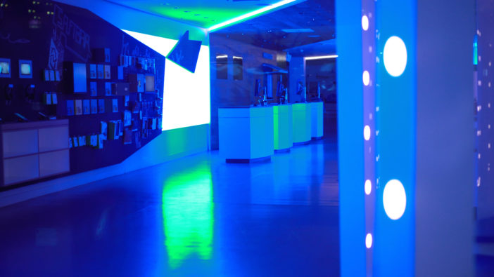
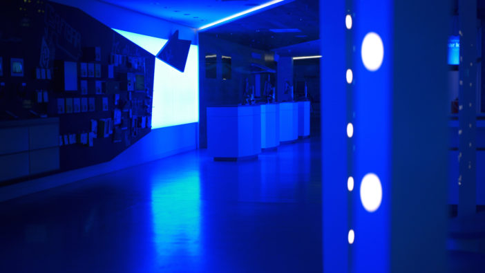
Sony problem 1 – clipped blue specular highlights in artificial light turning green (for example at concerts, performances, etc.)
EOSHD Pro Color fixes this (same exposure, same white balance) –
Sony problem 2, 3, 4, 5 and 6 (yes all in one shot!!) – lifeless skintones, yellow cast, lack of warmth, poor highlight roll off, reds clip to orange too early
EOSHD Pro Color gives back warm tones and improves highlights for a more Canon-like feel – this is also FAR more realistic and as the eye sees it (click to enlarge)
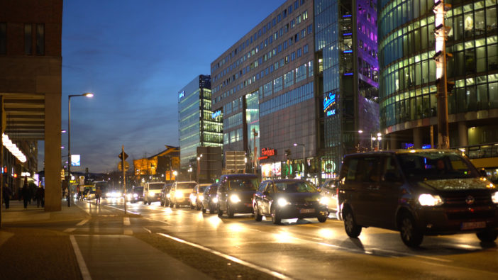
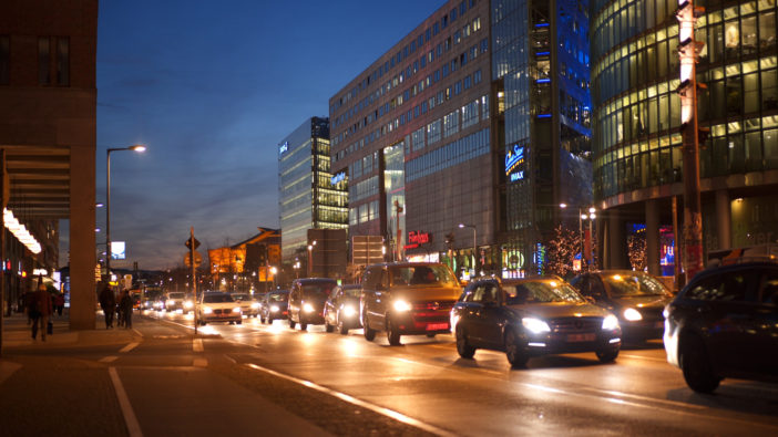
Sony problem 7 – limited colour gamut with a lack of range between the yellow of the street and blue of the sky
EOSHD Pro Color returns the warm glow of the street colours, yet also gives more definition in the blues, with a much more realistic dusk sky and sunset
Sony problem 8 – camera does not have an ambience priority white balance mode like the Canon 1D X Mark II, leading to lifeless colour
EOSHD Pro Color fixes this while also increasing colour depth for every channel so that the shot is now richer and more complex – no longer just green and blue
EOSHD Pro Color is not a hack or just a white balance shift. It is an ambience priority Rec.709 picture profile you dial into the camera menus and save. The results you see here haven’t been graded in post. They don’t need a LUT or a colour correction workflow. For the times you don’t shoot S-LOG or if you are just not an S-LOG user, this is by far the best picture profile to use over any of the ones that come preset in the camera menus.
