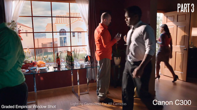
The third and final part of Zacuto’s debate provoking documentary on cinematography and cameras is out. Part 3 is to me kind of like Revenging the Revenge because it goes back to a non-creative scientific (empirical) test of the cameras.
They appear in order of cost from the $700 iPhone to the $70,000 Sony F65 and each are treated with the same lighting, similar settings and the same grading to match as closely as possible.
Empirical vs creative
For me the creative test in part 2 gives a more accurate idea of real camera performance.
Rather than have each camera set up optimally, they are just thrown in there and left to cope. This is not how to handle the cheaper cameras even in an empirical test. The more expensive stuff has a wider operating window, and don’t need as many work arounds. Yet people tend to put too all the weight and importance into this form of empirical testing, even though it has nothing to do with how you’d shoot in the real world.
I loved what Zacuto did in Part 1 and 2. Not just because the message was more inspiring but because it was more relevant to how cameras are actually used. An ‘in the field’ view of the true optimal performance of each camera.
Regardless of that and despite Part 3 only being available at a very low bitrate over Vimeo streaming (approximately 7Mbit!) there’s much to chew on here.
Here’s a resolution comparison between the mighty 8K sensor equipped Sony F65 at 1080p vs the cheap cameras.
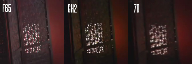
The Epic and F65 are dealt a bad hand in the empirical test because they are 4K beasts restrained on a 1080p leash. If it was truly empirical then you should be observing them at 4K or even 5K.
Next up here’s a comparison between the top 1080p shooting cameras and the Alexa, and the iPhone just for laughs.
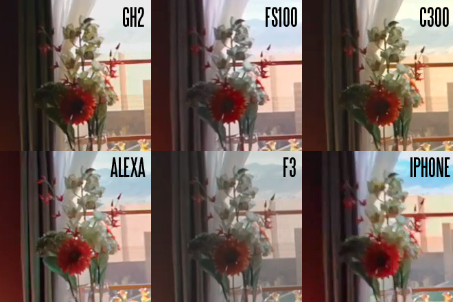
All apart from the Alexa are ungraded. I’m using the Alexa as a reference image, especially for colour.
It is interesting to compare the quirks of the other cameras out of the box, before grading work is applied. The FS100 has a megenta tint with the picture profile they used, the GH2 and especially the Canon C300 had a yellowish one. On the F3 they used a very flat LOG profile which gave plenty of dynamic range but left plenty of work to be done on colour and tonality. On the iPhone the cartoon like colour stands out like a sore thumb!
However it has somehow managed to hold onto quite a lot of the window without burning it out, and that is with no lighting fix. What I don’t understand is how they managed to make the GH2 have less dynamic range than an iPhone.
We know this is not the case. Maybe the 235-255 were clipped in AVCHD or the shot was slightly over exposed. If you set the ISO to the same on all cameras the actual sensitivity given equal t-stop and shutter angle will be different. For example the old GH1 was nearly a stop brighter at ISO 400 compared to the 7D and 5D Mark II at the same ISO.
Part 3 added some new shots not yet seen in the test like a close up of the window area but I found certain aspects of this part of the test not quite as sound as Part 2. Take for instance the lovely lady by the window with the wine glass.
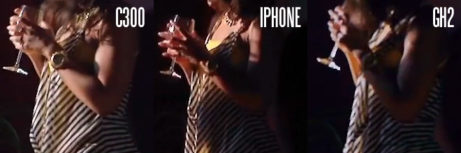
How is it that the focus is so off on the GH2 shot?
Why is there so much aliasing on the C300 shot?
As we have seen from the other shots there is no way the iPhone and C300 resolve this much more detail than the GH2.
I don’t think the GH2 should be leading the empirical test but neither do I think it is nearly as bad as portrayed in Part 3.
Next was the banding test but it was completely null and void as delivered, because a highly compressed Vimeo stream introduces a great deal of banding to every shot even the Epic (below) which was acquired in a 12bit raw recording format.
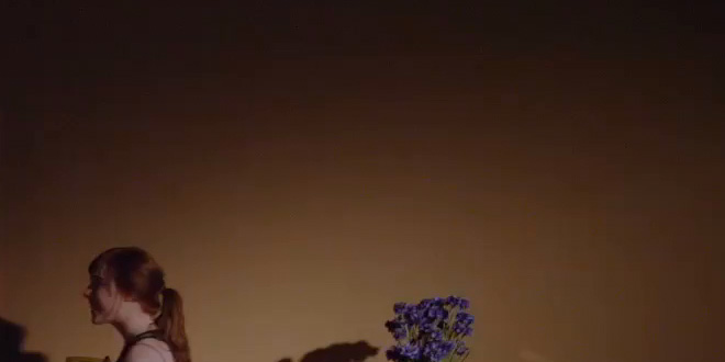
I think if Zacuto are going to post streaming clips with any claim to camera performance they really do need a disclaimer at the beginning about web compression because not everyone will realise that it is Vimeo causing the artefacts not the camera.
As with part 2, hopefully Zacuto will make Part 3 available for download in a 3GB lightly compressed H.264 file (really it should have been available to watch like this off the bat). So treat this part of the test as valid only how it was originally shown by Zacuto in theatres.
I also feel another disclaimer is needed about the grading. A lot of people complained in Part 2 that the Epic shot had a yellow tint caused by the camera.
Actually this was caused by the grading. Part 3 had a split screen with two grades – the empirical (treating each camera the same) and creative (adjusting the grade creatively for best results).
Out of the box certain cameras have biases towards magenta, cyan or yellow in the highlights because one channel clips before the other. This is a technical flaw but of course the grade has even more affect on the image and in neither the empirical or creative shot did they get a proper white balance in the window with the Epic!
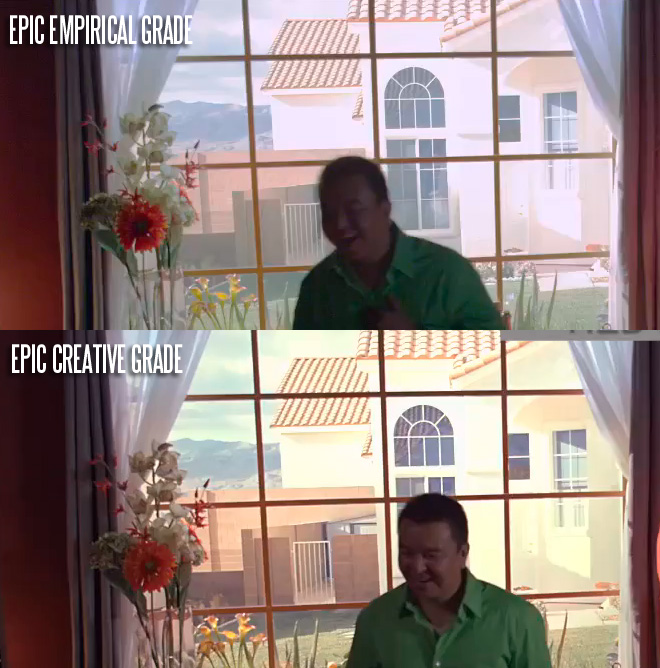
I’m really surprised at how much yellow there is in the creative grade and it is no wonder the Epic was marked down in Part 2 because of this. If I was Jim Jannard I’d be a tad annoyed. I am all for a warmer tone overall but I tend to avoid it in the highlights as it will turn your super whites orange or yellow. Contrast this to the F3 shot which is magenta in the empirical grade but perfectly white balanced in the creative grade. Although I actually rated the Epic as nicer to look at overall than the F3 in Part 2. Go figure!
My next piece of advice for the Zacuto team is a few improvements to the actual shooting of the docu itself. I know Steve is very close to his noisy old Panasonic Vari Cam but please, no more! The noise on the audience soundbites is awful. I find that amount of noise totally distracting and I am someone who is all for film grain and avoiding that smooth plastic look – this was simply too much. Finally, too many times the default composition for interviewees is a really extreme close up, even when it doesn’t seem to serve the point they are making. I’d have preferred to have seen a wider composition for some of the interviewees to catch more of their hands, their body language and their setting. Them talking on set would have been a great setting. The black backdrops are a bit bland for me. There are times when I feel like I am watching a documentary examining the finer skin texture of faces rather than one about cinematographers!
The only other point I feel the team could have improved on is to make some of the overall points a bit shorter and less obvious. Too many times it was a lot of similar talk about how creativity is more important than specs or pixel peeping, which I feel is a bit obvious and only needs to be said once. If you try to stretch it out to 3 parts it gets a bit repetitive. Of course the message is correct but it omits too much of the other side – ideally you need to suss out both and it is the job of a cinematographer to deal with that technical side as well as the imaginative side and the aesthetic judgement part, which I believe is actually more a gut instinct than something learned (unlike camera operation).
This aside and the slightly flawed Part 3 overall I really enjoyed the Revenge of the Zacuto Shootout, 2012.
I think it is time next year to change the format more drastically though. As an empirical test it falls a little bit short, but as a cinematography documentary it is genuinely groundbreaking and I’d like to see more creative people go head to head in a controlled environment with a level playing field camera wise, which is really in essence what we have at the moment from $700 to $70,000 and challenge each other in seeing who is the most imaginative. Let the Zacuto Shootout 2013 be Revenge of the imagination.
