A-mount? 2x crop sensor? Both the Sony A99 II and Panasonic GH5 have a few aspects which look out of place in the high end market of 2016. However sometimes the most simple things are the problem.
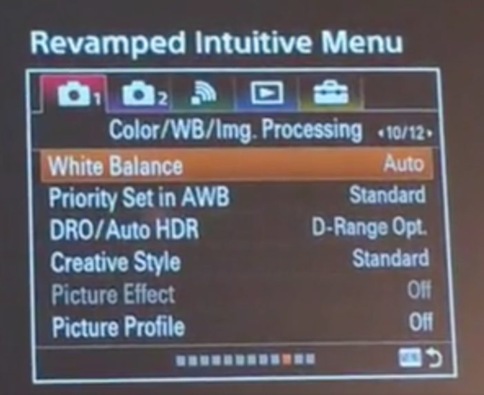
Sony’s re-designed menus have white balance on page 10/12.
Look at the screen capture above – does the new Sony menu revamp go far enough?
I’d say it looks like an unmitigated disaster.
If something as important as the picture profile and white balance are on page 10, what the hell is on the previous 9 that is more important?!
Here’s how the Alpha menus currently look (on my A7S II) –
Bafflingly, Sony still seem to think pros need WiFi / wireless comms on it’s own tab. I would have thought that would be the first to go in a sub menu.
Remember these are high-end $3k cameras for enthusiasts and pros.
Sony have reduced the number of menu tabs to 5. The previous tabs numbered 6 but they were not the problem. The sheer number of pages with options scattered seemingly randomly around were.
In their infinite wisdom Sony seem to have gone from 9 pages up to 12 in the new shoot menu, as first seen on the a99 II announced today at Photokina.
It remains to be seen whether options are more sensibly grouped together, the Color/WB/Image processing label on the screen capture would hint that they got the hint!
As cameras grow ever more complicated, will manufacturers find a way to simplify their menus better? I am not holding my breath!


