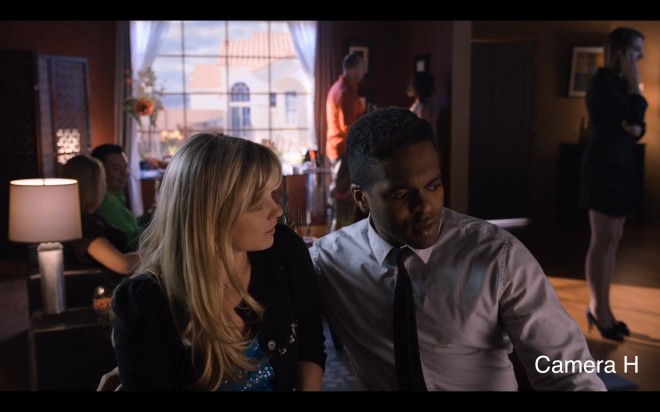
Above: one of my favourite scenes from the episode, click it to enlarge to 1080p, the colour on this shot is ‘early Technicolor’ and ‘Hitchcockian’. But I am not 100% sure which camera was used to shoot it (although I have a gut feeling!) – and that tells you a lot about how evenly matched cameras like the FS100 and GH2 are with much more expensive offerings (if viewed at 1080p)
If you haven’t already I advise you to watch the episode before reading this and draw your own conclusions first. If you have seen the full screening please do not reveal the results on the comments forum.
The Zacuto Shootout is like a torch light in the dark for many aspiring, young filmmakers and it is useful – not to mention fascinating and enjoyable – to see these incredible tools fight for the best image. Now the Revenge series has added people into the mix it is even more interesting and educational.
As the scenes went on I quite enjoyed some of the acting, actually. Subtle stuff came out like the jealous look from the girl on the back sofa as the lead actor sat down with his arm around the girl at the front. They seemed to gel as a team pretty well as the shoot went on. The cast deserve some recognition as well as the cinematographers.
In my view the way to handle a DSLR, indeed many of the current generation of digital cameras with a more limited dynamic range than film is to underexpose slightly to protect highlights and to boost the fill lighting. Digital is very sensitive but horrible under exposed. Digital needs light to really bring out the rich texture and colour that film has in abundance but the operating window is far narrower so you need to be careful.
Unfortunately I wasn’t around London or any of the screenings. So for me it is a shame the compression is so high on the Vimeo clip and that no downloadable high bitrate copy is available!!
Film grain is a very important aspect and it is all macro-blocking in the shadows on Vimeo. Resolution too only visibly falls short on two out of the 8 scenes when I know the difference is actually much larger between the F65, Epic, Alexa relative to the 1080p cameras. So is it a true picture when viewed via the web? Not really. Bare in mind that on a 4K projector, the Epic and Sony F65 would run away with it and I can understand to some extent the frustration of Red users with this test because showing it via Vimeo in compressed 1080p does not allow the Epic and F65 to shine.
You could also argue that the lens has an even bigger impact than the camera, and that had one of the scenes been shot in 2.39:1 anamorphic many people would have gone for that look as being more cinematic, regardless of the camera used. For me anamorphic is more important than 24p!
Here’s how I rated each scene / camera / operator…
Camera A
A bit muddy, didn’t like the low contrast, the lower colour temperature or the slight shift to yellow. A bit metallic looking and not as emotionally satisfying as B or C.
Camera B
Much better, loved the colour, plenty of detail in the blacks. Actors no longer in the shade. Highlights in window only weak point but preferred the warmer colour tone. The only negative is that this shot looked a little bit plastic and not quite as understated as others.
Camera C
Great detail on the wide shot at the start, of the table near the window, visibly more than Camera A. Very nice all rounder with no real flaws. F65? Alexa?
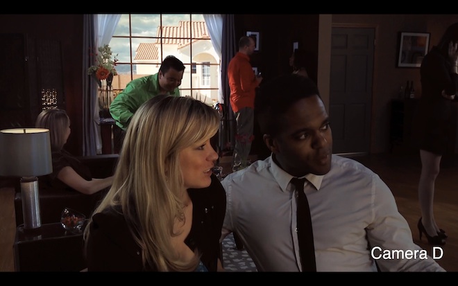
Camera D
One that visibly falls short even on the web. A very soft image to begin with, improved on close-up. Didn’t like the artefacts on edges of highlights, but cinematographer did a great job squeezing the dynamic range in the scene to fit. I think this was the iPhone shot and the size of the bokeh / deep depth of field is pretty telling due to the small sensor.
Camera E
No major weaknesses in this image, camera wise (apart from some aliasing on the high contrast edge of the lamp shade), good detail. But the lighting is a little murky (shadowy actors again) and colour temperature isn’t warm enough for my tastes. I’d say this was the FS100.
Camera F
Nice warm colour balance, outside area looked superb on this shot. Hard to tell via web but could be the Alexa or maybe the Epic? Certainly a lot of dynamic range on display here.
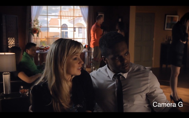
Camera G
The problem with this scene is that the lighting inside is unrealistically dim given the huge window and bright outdoor sunlight streaming through the window. This fixed nothing because somehow both the highlights are blown and the set is too dark. In my opinion this scene looks worse than the iPhone because it isn’t naturally lit. A few give away signs on this are the moire on the lamp and window frame. Blown highlights and muddy shadow detail. If I was being cruel to Canon, like I often am, I’d say this was the dated old 7D and not particularly well handled either. Sorry! But that is how I saw it.
Camera H
Stands out. Not as natural looking as camera C but pretty damned good. Nice dynamic range, but not as flat as some – satisfyingly punchy and contrast image with good tonality. Moody lighting added dramatic ‘Hitchcockian’ feel. Colour slightly unnatural but again reminds me of Rear Window film-like earlier Technicolor look. Certainly get the affect of the sun streaming through the window onto the floor with this scene. To me this reminds me most of the GH2 with is a superb camera if you know how to work around its limitations.
Camera I
Although the highlight roll off was nice on the guy’s red shirt near the window compared to Camera H, this is the third scene in the test with some aliasing and murky colour. Also the window frame looks distracting for some reason when the focus rack occurs, not a nice roll off in the highlights. No super-white, clearly someone trying to protect the highlights but it doesn’t help the overall image, better to have more contrast BUT the main reason I didn’t like this scene as much as others was down to the lighting not the camera setup. Fill lighting should have been brought up far more, to match large window and brightness of outdoor lighting. All the actors are in shade!
Conclusion
Overall I’d say B,C, H and F look best. B, C and possibly F are definitely high end cameras.
Hard to choose one but I loved the film-like yet slightly quirky colour and sparkling detail of H, and for all-round perfection B.
As far as I understood, the GH2 was shot with hacked and un-hacked. It would be nice to see the difference.
Zacuto’s 2012 shootout is off to an compelling start. Despite that I have some suggestions to make it even better. I’d like to see fewer sound bites, rather, for the cinematography experts to speak a little longer. I’d happily watch an hour long episode and get the full flow of their wisdom. I’d like for there not to be such a large gap between episodes. 1 month until the next showing is too long and by then there will be tons of spoilers about the results on internet forums. I’d like to see a little less emphasis on story telling and more on cinematography. Although it is the job of a cinematographer to assist in telling a story, and adding emotion and visceral impact to that story, a cinematographer is not the same as a writer, or even a director. Finally I’d prefer it if the Zacuto team recognised the full value in shootouts in a technical sense rather than adding the disclaimers about talent. We all know, because it is obvious, that talent makes a huge difference and it really matters more. But there is a place – a big place – for pure analytical judgement of a product’s performance, and even consumer advice – for those filmmakers just starting out who can only afford to own one camera at a time – I know from prior experience that it is damned important to choose the right one.
